 Docs
DocsDimensions and breakdown
Dimensions
Dimensions are user-defined Attribute values related to a single event or all events in the project. The Dimensions tool makes it possible to create a separate analysis scope by filtering timelines based on the dimension value configured by user. Applied as a filter, it considers timelines where the selected attributes have certain values. This allows you to focus analysis on processes containing more specific aspects, which can be challenging to consider otherwise.
For example, you want to investigate the processes involving a certain employee in them, to assess their contribution to the workflow. In the uploaded data, you have a mapped attribute Employee, so with the help of the Dimensions filtering tool you can configure a dimension:
- Where this employee is involved in a certain event
- Where this employee is involved in any of the events
Then apply this dimension as a filter to sort out the timelines where the employee in question is not involved, and keep a set of timelines where this employee contributes.
Accordingly, you can use any attribute from your project data and focus on it. For instructions on how to create a dimension properly, see Using dimensions as a filtering tool.
Dimensions are presented in Process Intelligence not only as a filtering tool but also as additional settings for some analysis modules or project configuration tools, where they have to be configured separately.
To open the Dimensions window, click ![]() in Filtering tools.
in Filtering tools.
Dimensions are based on Attribute values, which are automatically added to the project by mapping during the data upload. To be able to configure dimensions, make sure that the uploaded data contains additional columns mapped as Attributes.
For details on uploading data, see Data Requirements and Mapping.
Using dimensions as a filtering tool
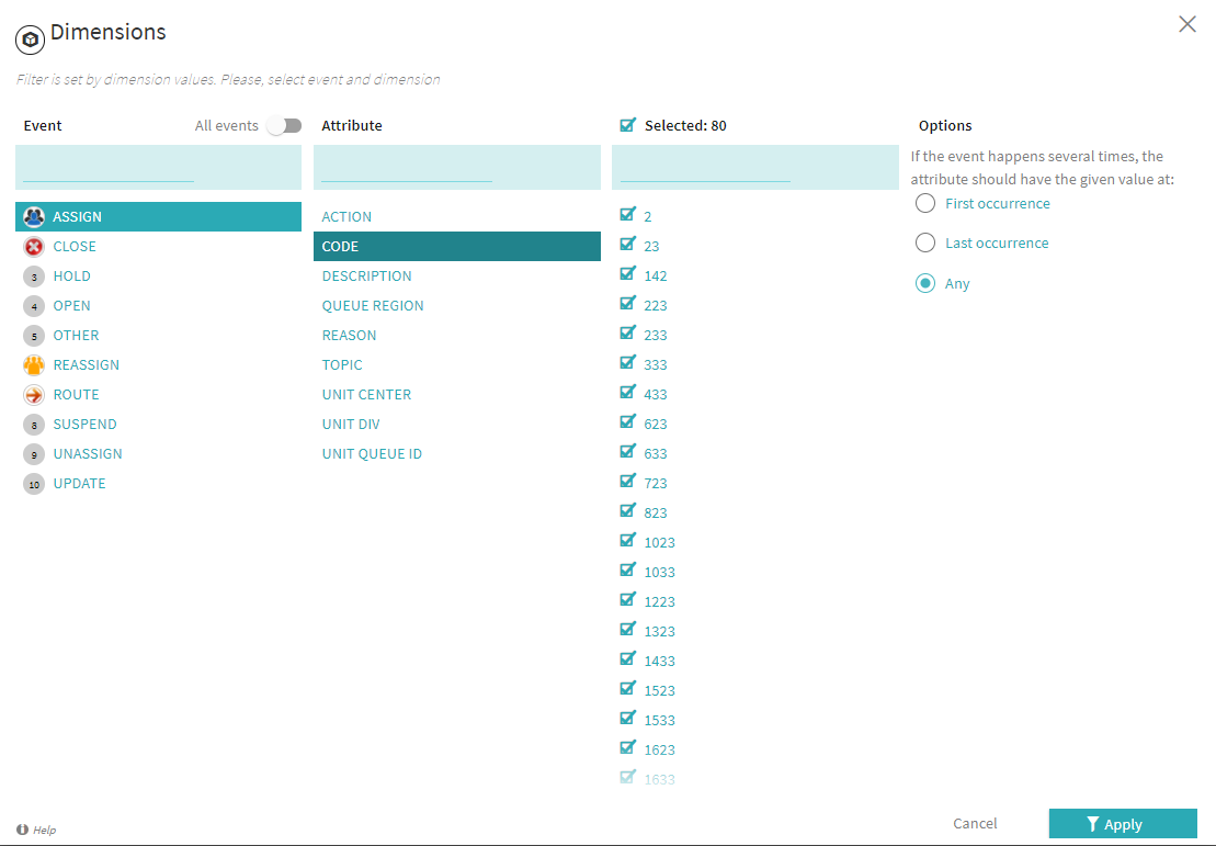
To configure a dimension, you need to select a single Event (or all events from the project), an Attribute belonging to it, and a group of attribute values.
- Click
 in Filtering tools to open the Dimensions window.
 -
Click an event name to select Event.
You can toggle on the All events option to consider every Event included in the currently selected timelines. In this case, all further settings will be applied to every event in the project.
-
Click an attribute name to select Attribute. Only one attribute can be selected, as a dimension is defined by a single attribute per configuration.
-
Optionally, select certain Attribute values. All values are selected by default. Unmark respective checkboxes to ignore certain values.
You can also unmark the checkbox near Selected, above the values list, to deselect all attribute values. It can be helpful when you need to select only some attributes from a long list, or vice versa - select all deselected events at once.
-
In Options, select which occurrence of the event to consider in the statistics, since events can occur more than once in a timeline:
-
First occurrence
Only attribute values belonging to the first occurrence of the selected Event per timeline will be considered.
-
Last occurrence
Only attribute values belonging to the last occurrence of the selected Event per timeline will be considered.
-
Any
Attribute values belonging to every occurrence of the selected Event per timeline will be considered.
-
-
Click Apply to use the configured dimension as a filter.
A new Filter by Dimensions will appear in the Current section.
Dimensions in other analysis modules and tools
Dimensions are included in several analysis modules and configuration tools, usually for breakdown purposes. You can use dimensions in:
-
In this expandable metric overview, click a metric histogram to open it in a separate window. There you can add a dimension to see its distribution for the currently selected timelines in descending order.
-
Breakdown analysis module
An analysis module based on dimensions. It allows fragmenting project data by breaking it down based on dimension values.
-
Here you can add a dimension to be able to switch the histogram display, making it based on the selected dimension values.
-
Here you can add dimension-based breakdown by attribute, to include dimension values into the analysis.
-
You can add dimensions to an aggregation configuration.
-
Some chart types require adding a dimension in the breakdown field to be able to display a chart.
-
The metric types Attribute value and Attribute distinct count require a dimension to be configured.
Breakdown
This analysis module is designed to fragment project data allowing users to drill down into specific dimensions. The dimensional data can be representative of the employee, department, region, or IT system that is responsible for the activities, etc. You can filter timelines based on Breakdown selections and proceed with a focused analysis using other features of the program. Here you can concentrate on the attribute distribution in your project, which can be helpful, e.g., when determining the root causes of performance issues.
For example, you can break down your data by employees, and find out that on certain steps too many tasks are reassigned to one specialist, who has the necessary skills or experience to perform them. It increases their workload and results in performance delays. Based on this information, you can introduce changes to the actual workflow, or organize knowledge-sharing workshops allowing other colleagues to learn how to handle such tasks.
Breakdown is based on dimensions, which are event and attribute pairs.
To use this analysis module, select Breakdown in the drop-down list under the project's name.
Configuration
Breakdown is represented by a hierarchy chart with rectangles sized differently. When first opened, the analysis module is empty. You need to determine a dimension by clicking +Select dimensions... and selecting a pair of an event (or all events) and an attribute.
After clicking Select, a hierarchy chart displays:
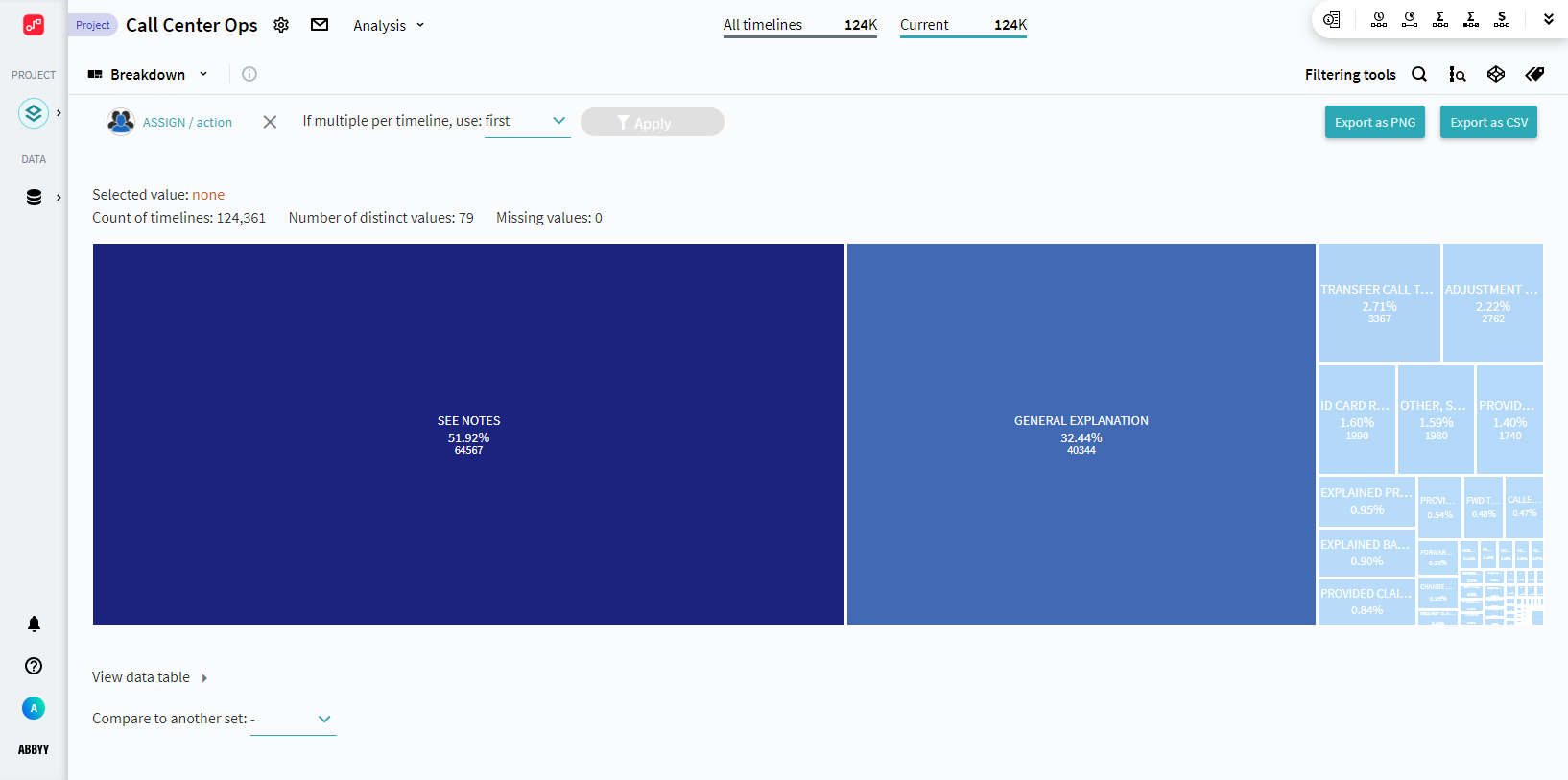
Events can occur more than once in a timeline, and the Attributes related to them may differ. After the chart is displayed, choose which of the occurrences to use in the breakdown. To do it, select one of the following options in If multiple per timeline, use:
-
first
Takes the attributes belonging to the first occurrence of the required event in timelines.
-
last
Takes the attributes belonging to the last occurrence of the required event in timelines.
-
per event
Takes the attributes belonging to each occurrence of the required event in timelines.
Workspace
The Breakdown workspace consists of the hierarchy chart itself, a data table, and comparison to another set.
Hierarchy chart
Above the chart is displayed a summary, showing:
-
Selected value
You need to click on a pane to select the value it represents. When a value is selected, here you will see its name, the percentage, and the number of timelines in which it occurs.
-
Count of timelines
The number of currently selected timelines in which the defined Dimension occurs.
-
Number of distinct values
The number of unique Attribute values belonging to the defined Dimension.
-
Missing values
The number of rarely occurring attribute values that are not displayed on the chart.
When you work with breakdown analysis, they always show statistics for the currently selected timelines. Pay attention to the filters that select the timelines to explore in the Current block at the top. For more information, see Filters.
The breakdown chart itself consists of rectangles, each representing one Attribute value. The rectangles have different sizes measured according to their frequency, the bigger the rectangle, the more frequent the occurrence of the Attribute value displayed on it.
The rectangles contain:
- The Attribute value name.
- The percentage of timelines in which the Attribute value occurs, where 100% is the number of timelines containing the defined dimension.
- The number of timelines in which the Attribute value occurs.
- Compared values - the number of timelines containing this Attribute value in the compared set and the ratio of the current set's value to the compared set's value.
The compared information appears only if there is a set selected for comparison. See Compare to another set.
You can use Attribute values as filters applied to the current set. Select a value by clicking on the corresponding rectangle, and click Apply. After that, an additional filter will be created in the Сurrent pane, which selects timelines by the presence of a specific event/attribute pair in them.
You can save the hierarchy chart to your computer in PNG format to share it with your colleagues or make use of it outside of Process Intelligence . Click Export as PNG in the upper-right corner of the window.
Data table
Along with the hierarchy chart, a table with the same data is created. The table display is more focused on numbers and can be exported in the CSV format to share it with your colleagues or make use of it outside of Process Intelligence. Click Export as CSV in the upper-right corner of the window.
The table is minimized by default, you can expand it by clicking View data table under the chart. It consists of three columns:
-
Dimension name
Contains Attribute values belonging to the dimension.
-
Count of timelines
Contains the number of currently selected timelines in which the Attribute value occurs.
-
Percent
Contains the percentage of timelines in which the Attribute value occurs, where 100% is the number of timelines containing the defined Dimension.
Selected Attribute values will be highlighted in the table. Click a table row related to the needed attribute to select it.
Compare to another set
You can select an additional set to compare attribute values' occurrences. Select an existing set in the Compare to another set: list.
The additional sets have to be created and saved in advance. For instructions on how to create a new timeline set, see Timeline Sets.
A bar chart will appear. It is based on a ratio, which is counted by dividing the quantity of attribute values from the current set by the quantity from the compared set. The chart consists of:
- Bars on the X-axis, that represent Attribute values, and are distributed based on ratio, from the highest to the lowest.
- The Y-axis that represents the ratio.
- Bar headers with the general value on the Y-axis, the number of occurrences of the attribute value in the current set/in the compared set. You can hover your mouse over the bars to see more details, including percentages.
