 Docs
DocsElements
This section details each element and the controls that can be applied to restrict the data input into the fields within an Interact Form.
Text
If you need to create a field that ensures a user types the correct information in the correct format, then the text element is the best solution.
As standard the text element supports the use of simple regular expressions which can be controlled by setting values for the fields detailed in the table below.
| Field | Description |
|---|---|
| Minimum character length | The minimum amount of characters that can be typed into the field. |
| Maximum character length | The total maximum number of characters that can be entered into the field. |
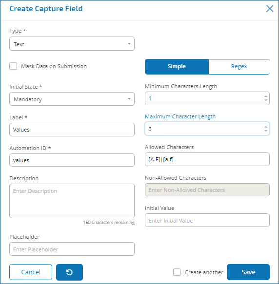
| Allowed characters | The character set that the user can use. This uses simple regular expressions and so a user can type ‘[A-F]’ forcing the user to only enter the characters between A to F, in uppercase. You can enter some of the other regular expressions such as the ‘|’ meaning ‘or’. So, if you enter ‘[A-F]|[a-f]’ a user can enter the characters between A to F either in upper or lowercase. See the image below. |
| Non-allowed characters | This works in a very similar way to the Allowed characters. Here you can specify the characters that you do not allow in the text field. For example, it could be as something as simple as ‘&’ to restrict the use of an ampersand when people are writing text. |
| Initial Value | The initial value allows you to specify the initial value that the user will see when they access the Form. |
| Mask Data on Submission | This is an important button when the information being submitted is sensitive and you do not want other people to see the data. For example, personal information about date of birth is a private piece of information. So, if you tick Mask Data on Submission the user will see dots appear as they type the information. This information is masked for everyone using Interact. When the data is forwarded into Blue Prism it can be ‘seen’ by the Digital Worker for processing in the automation. |
Number
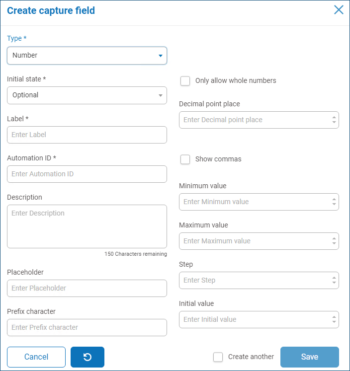
The number element has numerous features to control how your users enter their data and how it is displayed.
| Field | Description |
|---|---|
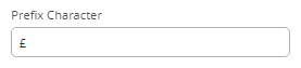
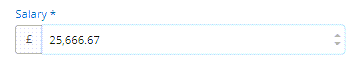
| Prefix Character |
Adds a prefix character in the form display. This is useful for when entering monetary values. The prefix character is not sent through to your automations.
|
| Only Allow Whole Numbers | Restricts the user to enter only whole numbers in the data field. |
| Decimal Point Place | Specifies the number of decimal places you want for the data entered. You can have up to a maximum of fifteen decimal point places. |
| Show Commas |
Enters a comma whenever the number gets over a thousand. This is the UK format with a comma used as a separator between thousands and a decimal point for fractions. As opposed to a lot of European countries where the comma and decimal point are swapped.
|
| Minimum Value | Sets a minimum value for the number to be entered by the user into the field. |
| Maximum Value | Sets a maximum value for the number to be entered by the user into the field |
| Step | Defines a step value. Working in conjunction with the ‘arrow’ in the data entry field, where a user toggling the ‘arrows’ will force the number to step in the defined steps. |
| Initial Value | Sets an initial value for number in the field. |
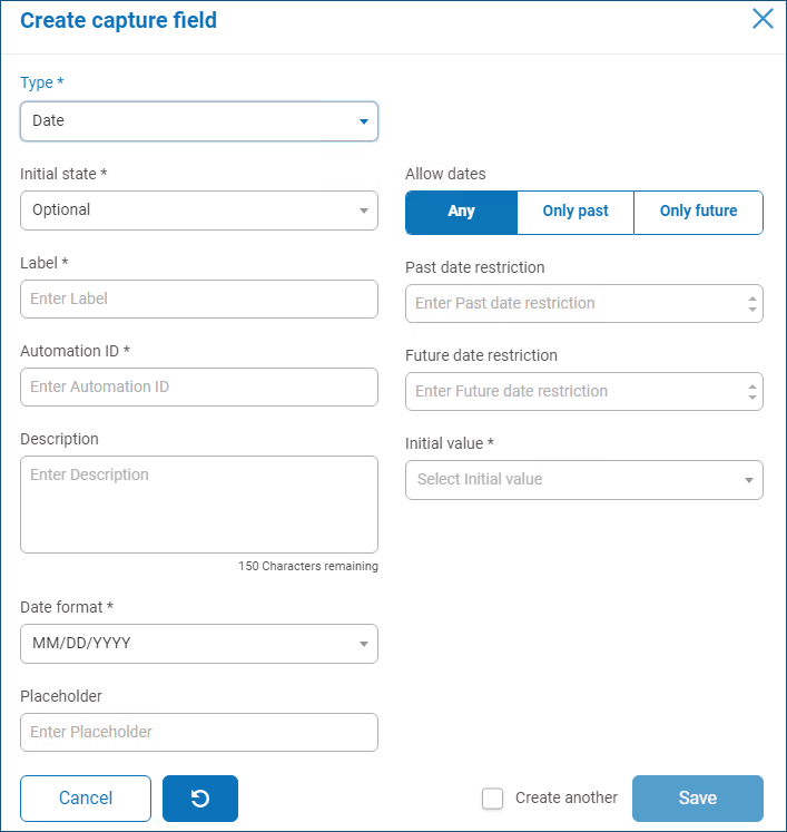
Date
The date element has a range of features to control how your users enter their data and how it is displayed. The blank Form below illustrates the options.
| Field | Description |
|---|---|
| Date Format | Define the format of the date. Three options are available which are US format MM/DD/YYYY, UK format DD/MM/YYYY and the International format YYYY/MM/DD. |
| Allow Dates | Controls whether you allow dates only in the past, only in the future, or any dates. For example, when entering a date of birth, it would only be dates in the past and not the future that would be required. |
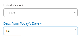
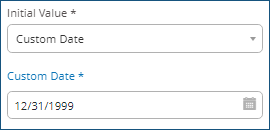
| Initial Value | A drop-down menu that offers five choices: None, Today, Today +, Today -, and Custom Date.
An Initial Value must be set. If you have no restrictions, this can be set to None. However, you can also restrict the initial value to Today or Today + or – a number of days. So, for setting an Initial Value of a fortnight ago, you would enter Today -, and then in the new field enter 14 days.
If that doesn’t give you the date as an Initial Value you require, you can select Custom Date and specify a specific date, for example the last day of the 20th Century.
|
| Past Date Restriction | Using the Past Date Restriction you can create a window on the dates that the user of the Form can access, for example setting 14 days will create a window of just 14 days in the past that the user can access. |
| Future Date Restriction | Using the Future Date Restriction you can create a window on the dates that the user of the Form can access, for example setting 14 days will create a window of just 14 days in the future that the user can access. |
When using the Past Date Restriction or Future Date Restriction field in conjunction with Today- or Today+, the date restriction must include the total number of days. The number of days for the window and the number of days past or future.
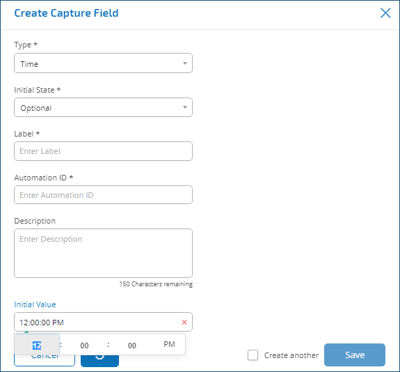
Time
There is only one field that can be used to control the user entry in the time element field which is the Initial Value.
This field will set a default value in the display that the user can then change as required, see below.
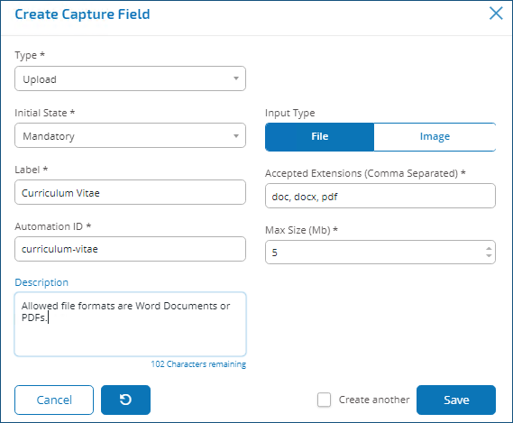
Upload
The upload element only has one controlling aspect which is the extension of the file being uploaded.
If Image is chosen as the file type, then you can select from one to three file types: JPG, PNG or GIF.
If File is chosen, then you can add a list of extensions that you want to support in the Form. These need to be added without the leading ‘.’ and separated by commas. You cannot load executables, those with ‘.exe’ extension.
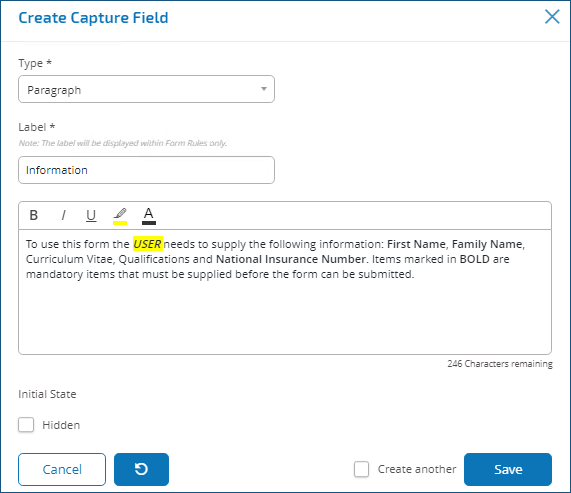
Paragraph
The paragraph allows the Form designer to add text into the Form to assist the user in submitting the correct information in the correct format. The form allows the designer to incorporate different formats to the text to emphasize the important parts of the text.
The paragraph can be deployed in a hidden state initially and then only revealed depending upon a rule condition being met, or updated when a Digital Worker has updated the Form from in an automation.
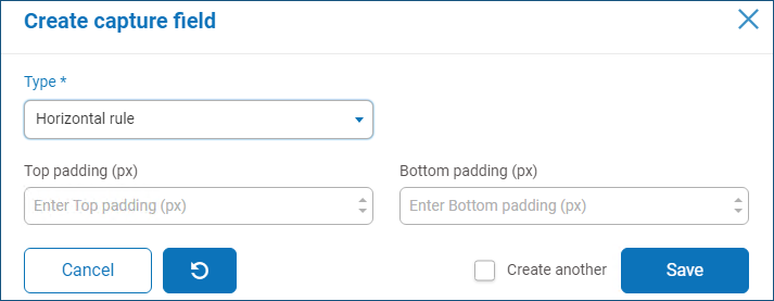
Horizontal rule
The horizontal line element is used to separate a form into sections to ease its readability. The line can be padded to control the space before and after, with a maximum of 999px either side of the line.
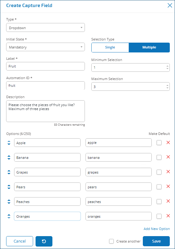
Dropdown
The Dropdown element allows the designer to configure a drop-down menu that the user can select from.
For a single selection, a list can be provided which will enable a user to select one item from the list. For a multiple selection the user can either choose any number of items, a minimum number of items, or a maximum number of items. This is dependent on the values configured in the Minimum selection and Maximum selection fields.
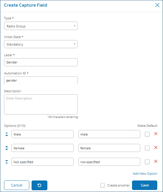
Radio group
The radio group element, like the Dropdown element, allows users to select a single item – this element does not allow for multiple entries to be selected.
The designer of the form controls what the user sees by listing the chosen items and if required can choose a default value.
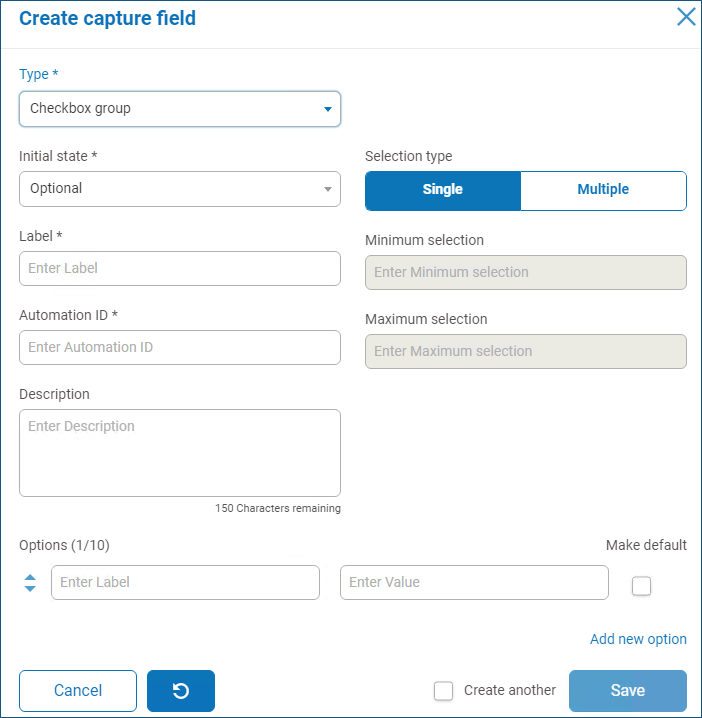
Checkbox group
The options available to the Form designer for the Checkbox group are the same as the Dropdown element. It is possible to choose between either a single selection or multiple selections. Similarly the number of items that can be chosen can be set using the Minimum selection and the Maximum selection values.
Table
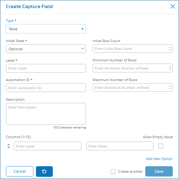
The table element allows the designer to control the number of rows in a table that the user sees.
The designer constructs the number of columns that they need and assigns column headings. A maximum of fifteen columns can be added to a table. The user can then add or delete rows to the table as controlled through the settings on the table element.
The designer can set the Initial Row Count, the Minimum Number of Rows, and the Maximum Number of Rows.
