 Docs
DocsUsing the capture types in forms
This section details each capture type and the controls that can be applied to restrict the data input into the fields within an Interact Form. There are
Text
If you need to create a field that ensures a user enters the correct information in the correct format, then the Text capture type is the best solution. The Text field is the most commonly used capture type. It allows data to be entered in alphanumeric combinations; so, both letters and numbers are accepted.
As standard, the Text capture type supports the use of simple regular expressions which can be controlled by setting values for the fields detailed in the table below.
| Field | Description |
|---|---|
|
Minimum character length |
The minimum amount of characters that can be typed into the field. This must be greater than 0. |
|
Maximum character length |
The total maximum number of characters that can be entered into the field. The maximum number that can be set is 50. |
|
Allowed characters |
The character set that the user can use. This uses simple regular expressions and so a user can type ‘[A-F]’ forcing the user to only enter the characters between A to F, in uppercase. You can enter some of the other regular expressions such as the ‘|’ meaning ‘or’. So, if you enter ‘[A‑F]|[a-f]’ a user can enter the characters between A to F either in upper or lowercase. |
|
Non-allowed characters |
This works in a very similar way to the Allowed characters. Here you can specify the characters that you do not allow in the text field. For example, it could be something as simple as ‘&’ to restrict the use of an ampersand when users are entering text. |
|
Initial value |
The initial value allows you to specify the initial value that the user will see when they access the form. |
|
Mask data on entry |
This is an important option when the information being submitted is sensitive and you do not want other people to see the data on screen. For example, personal information about date of birth is a private piece of information. So, if you select Mask data on entry, the user will see dots appear as they type the information. This information is masked for everyone using Interact. When the data is passed to Blue Prism, the Digital Worker is able to view the data for processing in the automation. Mask data on entry is only available within the text field. Therefore, if you want to submit a number and redact the content after submission then you should use a text field to input rather than a number field. |
|
Purge data on submission |
This is an important option when the information being submitted is sensitive. If this option is selected, any data entered into this field by the Interact user will be removed when the form is submitted and will not be stored in the Interact database. The information that was entered into these fields will not be present in the audit log entry in Hub for the submitted form. The data is only stored in the Blue Prism database, and any additional storage destinations configured as part of the automation process for the form. For fields where this option is set, an information icon displays next to the field on the form with a tooltip indicating that the information in this field will be purged. To prevent Interact approvers from being able to see information entered into this field, select Mask data on entry in addition to Purge data on submission. |
Alternatively, Regex can be selected and more complex regular expressions can be configured. For more information, see Using regular expressions.
Text field example
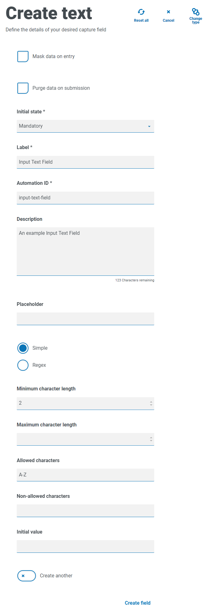
In the example below, the field has been set to mandatory with a minimum limit of two characters but no maximum limit on the number of characters entered. The field has been restricted to uppercase characters by applying a simple character restriction.
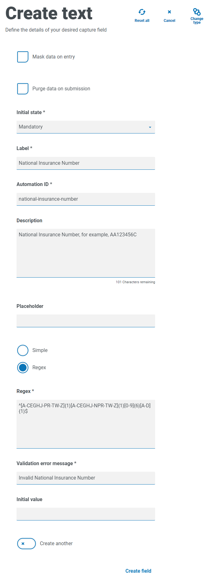
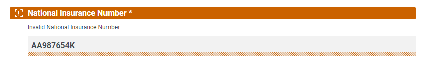
Using the Regex function, you can create a complex restriction. Using the UK National Insurance Number as an example, a regular expression can be applied that will ensure that the correct format is always entered. If not, a warning message will be given.
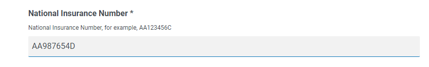
You can test the character string restriction and view the field behavior. Enter a correctly formatting number into the appropriate form field on the Edit form page, this value is accepted and validation error message is not displayed. Then, clear the field and then enter an incorrectly formatted number, this results in the validation error message being displayed.
Text area
The Text area capture type has many of the same features as the Text capture type, but enables the user to enter a large amount of information as multiple lines of text, up to 3500 characters. It allows data to be entered in alphanumeric combinations; so, both letters and numbers are accepted.
By default, the Text area capture type uses simple regular expressions, which can be controlled by setting values for the fields detailed in the table below.
| Field | Description |
|---|---|
|
Minimum character length |
The minimum amount of characters that can be typed into the field. This must be greater than 0. |
|
Maximum character length |
The total maximum number of characters that can be entered into the field. The maximum number that can be set is 3500. |
|
Allowed characters |
The character set that the user can use. This uses simple regular expressions and so a user can type ‘[A-F]’ forcing the user to only enter the characters between A to F, in uppercase. You can enter some of the other regular expressions such as the ‘|’ meaning ‘or’. So, if you enter ‘[A‑F]|[a-f]’ a user can enter the characters between A to F either in upper or lowercase. |
|
Non-allowed characters |
This works in a very similar way to the Allowed characters. Here you can specify the characters that you do not allow in the text field. For example, it could be something as simple as ‘&’ to restrict the use of an ampersand when users are entering text. |
|
Initial value |
The initial value allows you to specify the initial value that the user will see when they access the form. |
Alternatively, Regex can be selected and more complex regular expressions can be configured. For more information, see Using regular expressions.
Text area field example
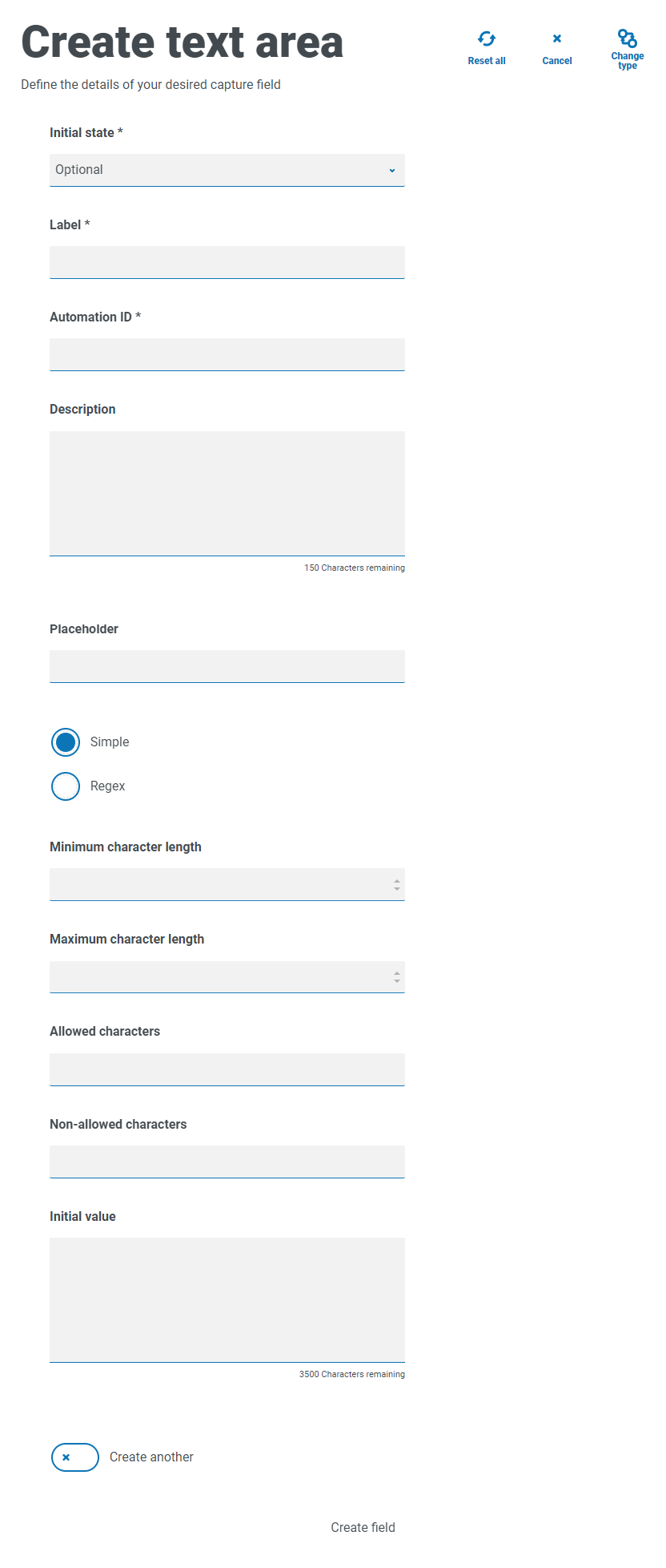
In the example below, the field has been set to optional without any further restrictions:
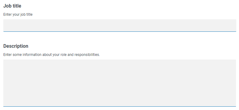
This example is shown below in conjunction with a Text field. The Text field is used to capture the user's role or job title and the Text area field is available for them to enter some information about their roles and responsibilities:
Number
The Number capture type has numerous features to control how your users enter their data and how it is displayed.
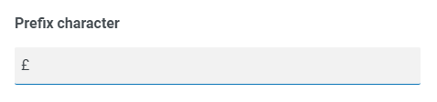
The Number field restricts the entry to numerical characters only. The field supports the use of the period or full stop ‘.’ as a decimal point and a comma ‘,’ for the thousand’s separator. If the number is a financial number, you can use the prefix character to apply any applicable currency symbol. Additionally, you can force the use of the comma ‘,’ as the number is typed by selecting the Show commas option. Finally, you can assign a minimum and/or a maximum value to the number if appropriate.
Multiple countries use decimal comma rather than a decimal point as a separator. If this is required, it is recommended that a Text field is used to define the applicable format rather than a Number field.
| Field | Description |
|---|---|
| Prefix character |
Adds a prefix character in the form display. This is useful when entering monetary values. The prefix character is not sent through to your automations.
|
| Only allow whole numbers | Restricts the user to enter only whole numbers in the data field. |
| Decimal point place | Specifies the number of decimal places you want for the data entered. You can have up to a maximum of fifteen decimal point places. |
| Show commas |
Enters a comma whenever the number exceeds a thousand. This is the UK format with a comma used as a separator between thousands and a decimal point for fractions |
| Minimum value | Sets a minimum value for the number to be entered by the user into the field. |
| Maximum value | Sets a maximum value for the number to be entered by the user into the field. |
| Step | Defines a step value. Working in conjunction with the arrow in the data entry field, where a user toggling the arrows will force the number to step in the defined steps. |
| Initial value | Sets an initial value for number in the field. |
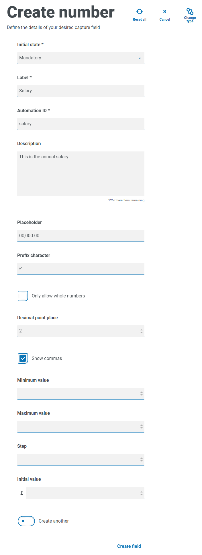
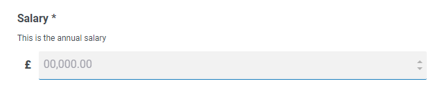
Number field example
In the example below, the Number field is being used to create a salary field. This captures a salary, prefixing it with the ‘£’ symbol and forcing the commas to be applied as a thousand’s separator. In this example, a Placeholder has also been defined. A placeholder will show gray text in the field prior to being typed into, thus a representative value can be displayed.
If you want to apply a specific Regex to a number, then you should use a Text field. This will enforce the format that you need. For example, the following Regex will check that a UK mobile telephone number is entered correctly:
^07([\d]{3})[(\D\s)]?[\d]{3}[(\D\s)]?[\d]{3}$
Date
The Date capture type has a range of features to control how your users enter their data and how it is displayed. The blank form below shows the available options.
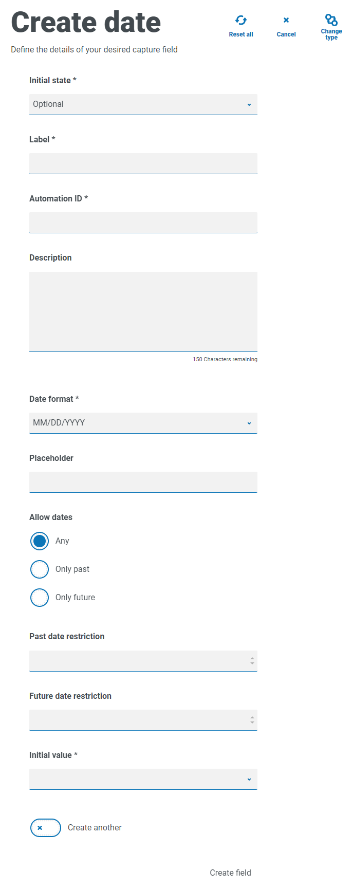
| Field | Description |
|---|---|
| Date format |
Define the format of the date. Three options are available:
|
| Allow dates | Controls whether dates are allowed only in the past, only in the future, or any dates. For example, when entering a date of birth, it would only be dates in the past and not the future that would be required. |
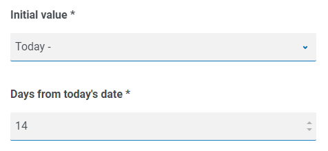
| Initial value | A drop-down menu that offers five options: None, Today, Today +, Today -, and Custom date.
An initial value must be set. If you have no restrictions, this can be set to None. However, you can also restrict the initial value to Today or Today + or – a number of days. So, for setting an initial value of a fortnight ago, you would enter Today -, and then in the new field enter 14 days.
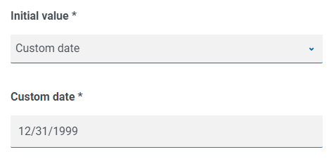
If that doesn’t give you the date as an initial value you require, you can select Custom date and specify a specific date, for example the last day of the 20th century.
|
| Past date restriction | Creates a window of the dates that the user of the form can access, for example setting 14 days will create a window of just 14 days in the past that the user can access. |
| Future date restriction | Creates a window of the dates that the user of the form can access, for example setting 14 days will create a window of just 14 days in the future that the user can access. |
When using the Past date restriction or Future date restriction field in conjunction with Today- or Today+, the date restriction must include the total number of days; the number of days for the window and the number of days past or future.
Date field example
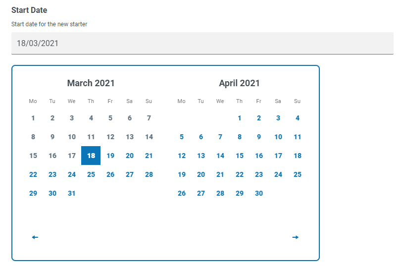
The example below shows a date field that can be used on a new starter joining form. The example specifics the date format as DD/MM/YYYY, however, there are two other options which are MM/DD/YYYY or YYYY/MM/DD. A placeholder has been entered showing the format that the date will appear in, and the date search has been restricted to only dates in the future from today’s date. If Today- is selected as the Initial value, you can then enter a number in Days from today’s date which restricts the calendar to commence a number of days past. Additionally, using the Past date restriction or Future date restriction fields you can create a ‘window’ of the dates that the user of the form can access, for example, setting 14 days will create a window of just 14 days that the user can access.
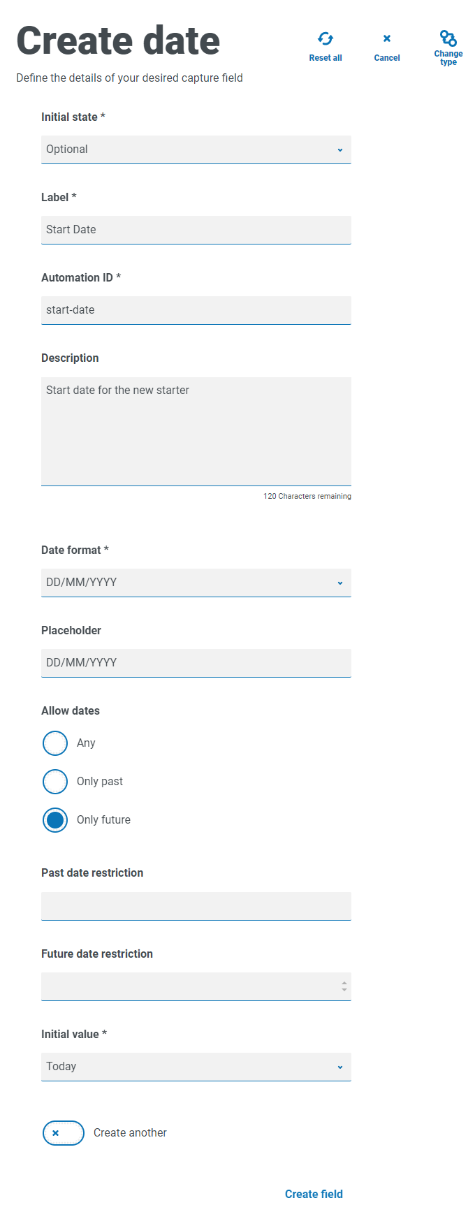
When reviewing the output, the user will see a pop-up calendar that they can use to select the date they require.
Time
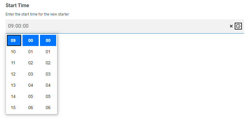
There is only one field that can be used to control the user entry in the Time field which is the Initial value. This field will set a default value in the display that the user can then change as required, see below.
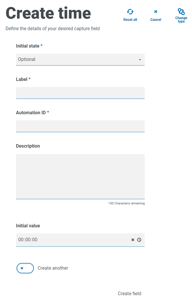
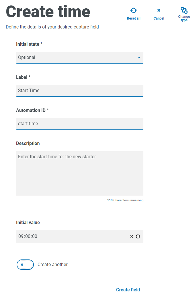
Time field example
The example below show the Time field capture properties and an example display within a form.
Upload
The Upload capture type allows a file or image to be parsed into an automation for further processing. The transfer is for any formats except for executable files with a .exe file extension. Files are stored within ‘blob’ storage and a URL is included in the collection sent to the Blue Prism Queue.
The Upload field only has one controlling aspect which is the extension of the file being uploaded, this being the Input type. If:
- Image is selected as the file type, then you can select from one to three file types: JPG, PNG or GIF.
- File is selected, then you can add a list of extensions that you want to support in the form. These need to be added without the leading ‘.’ and separated by commas. You cannot load executables, those with ‘.exe’ extension.
By default, the maximum file upload size is restricted to a maximum of 5 MB and the image size is restricted to 1920 x 1080 px.
The maximum size can be increased by a system administrator by changing the value defined in the Hub configuration file on the server. The value specified in the Max size field on the Create upload page cannot be greater than the value defined in the configuration file (by default, this is 5).
Upload field example
An example upload field is shown below that will allow the Interact user to upload a CV of the new starter. The document that is uploaded can be in PDF, Microsoft Word, or Text format.
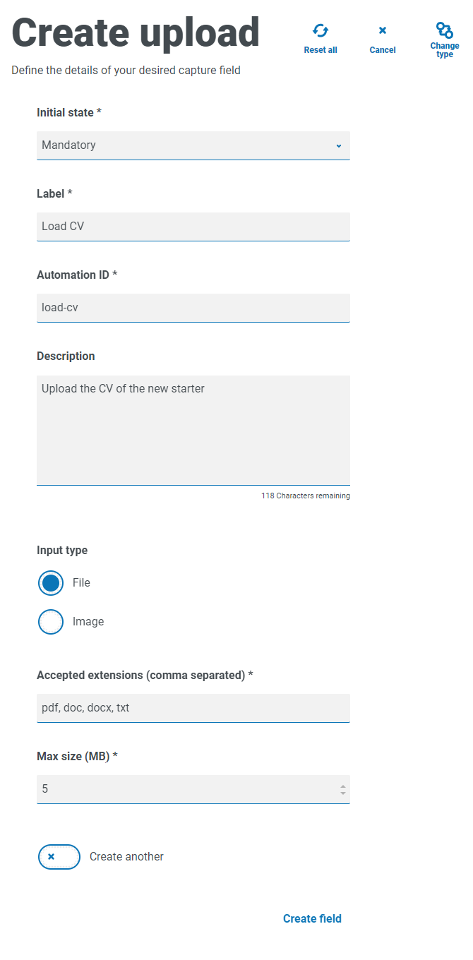
The allowed extensions must be entered without a leading period or full stop ‘.’.
The user will see the following in the form when they are submitting a request.

Paragraph
The Paragraph capture type allows you to add formatted text onto the form to provide information to assist the Interact user in submitting the correct information in the correct format. You can use formatting techniques to bold, underline, italicize, and highlight text to emphasize the important parts of the text.
The paragraph can be deployed in a hidden state initially and then only revealed depending upon a rule condition being met, or updated when a Digital Worker has updated the form in an automation.
Paragraph fields are restricted to 500 characters.
The formatting options are:
|
|
Bold – Select the required text and click this icon. The text displays in bold. |
|
|
Italic – Select the required text and click this icon. The text displays in italics. |
|
|
Underline – Select the required text and click this icon. The text displays underlined. |
|
|
Highlight – Select the required text and click this icon. The text displays highlighted in yellow. |
|
|
Text color – Select the required text, click this icon and select the required color from the palette. Alternatively, if you want all the text to be a different color, select the color before you start typing. |
|
|
Link – Select the required text and click this icon. In the Add link dialog, enter the URL and click Save. The link is added to the text. When you hover over the text with your mouse cursor, the text displays as underlined indicating the presence of the link. |
|
|
Unlink – Select the required text that has a link applied to it and click this icon. The link is removed. |


The text is not submitted as part of a request to Blue Prism and therefore there is no Automation ID.
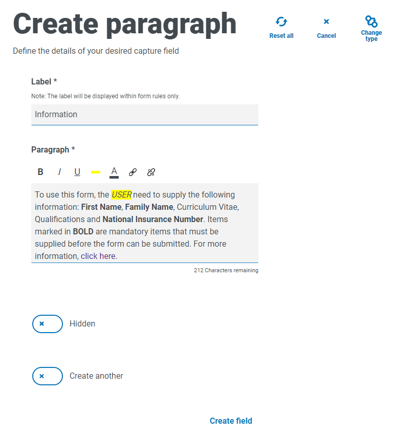
Paragraph field example
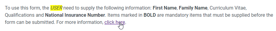
An example of the text on a form is illustrated below.
Horizontal rule
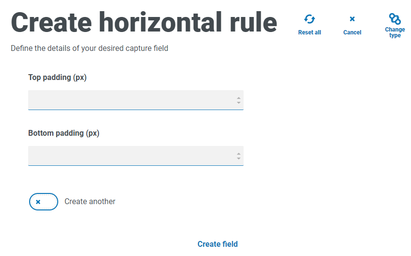
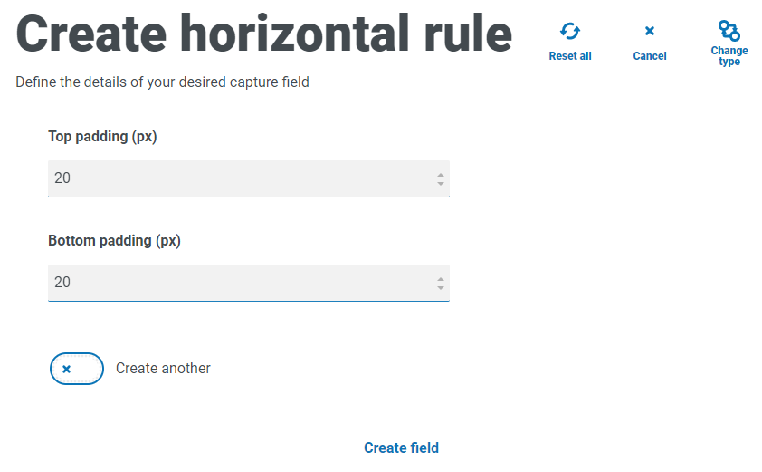
The Horizontal rule capture type is used for cosmetic purposes to break up large pages in a form, by separating the form into sections to ease its readability. The line can be padded to control the space before and after, with a maximum of 999px either side of the line.
Horizontal rule field example
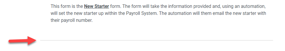
The example below shows the padding settings for a horizontal rule and how it appears below a paragraph field example.
Dropdown
The Dropdown capture type enables you to configure a drop-down menu that allows an Interact user to select either single or multiple items from a drop-down menu.
For a:
- Single selection, a list can be provided which will enable a user to select one item from the list.
- Multiple selection, the user can either choose any number of items, a minimum number of items, or a maximum number of items. This is dependent on the values configured in the Minimum selection and Maximum selection fields.
A maximum number of 250 items can be added to a drop-down field.
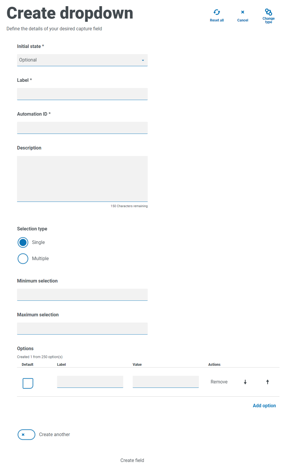
| Field | Description |
|---|---|
|
Minimum selection |
The minimum number of items that the user can select from the drop-down list on the form. This field is not relevant if the Selection type has been set to Single. |
|
Maximum selection |
The maximum number of items that the user can select from the drop-down list on the form. There is no restriction on the maximum number that can be set. If no value is set, the user could select every item in your list. This field is not relevant if the Selection type has been set to Single. |
|
Options – Default |
If this is to be the default value for the drop-down field, select the Default box. |
|
Options – Label |
The text that will be displayed in the drop-down list. Labels are restricted to 50 characters. |
|
Options – Value |
The value associated with the drop-down item. This can be different to the label. The value is restricted to 50 characters. |
|
Options – Remove |
If required, click Remove to delete the item from the list. |
The Radio group and Checkbox group fields perform a similar function to the Dropdown field, which is the selection of either a single or multiple items. However, if the space on your form is restricted, then the Dropdown is the recommended route especially if there is a large quantity of items. If there are only a few items to select from and the form overall size doesn’t matter, then either the Radio group or Checkbox group fields can be utilized.
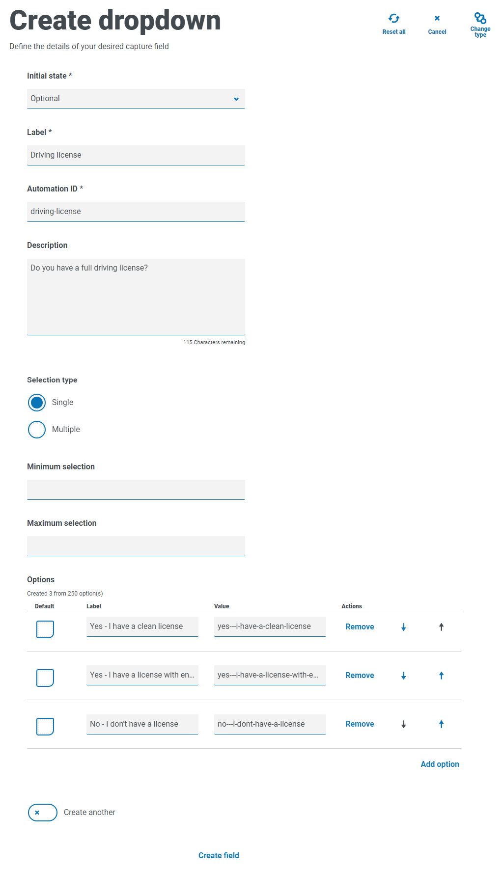
Dropdown field example
An example configuration of a single selection drop-down field is shown below:
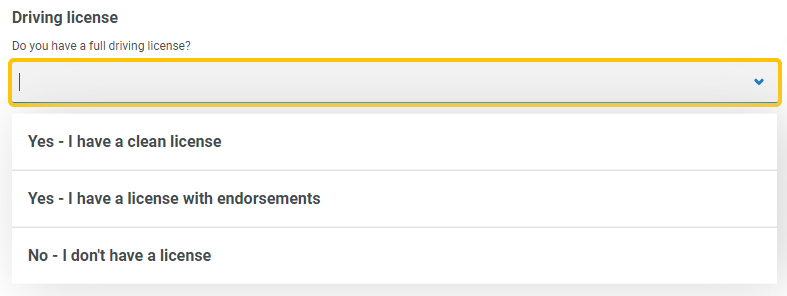
This will create the following element in the form for the user to access.
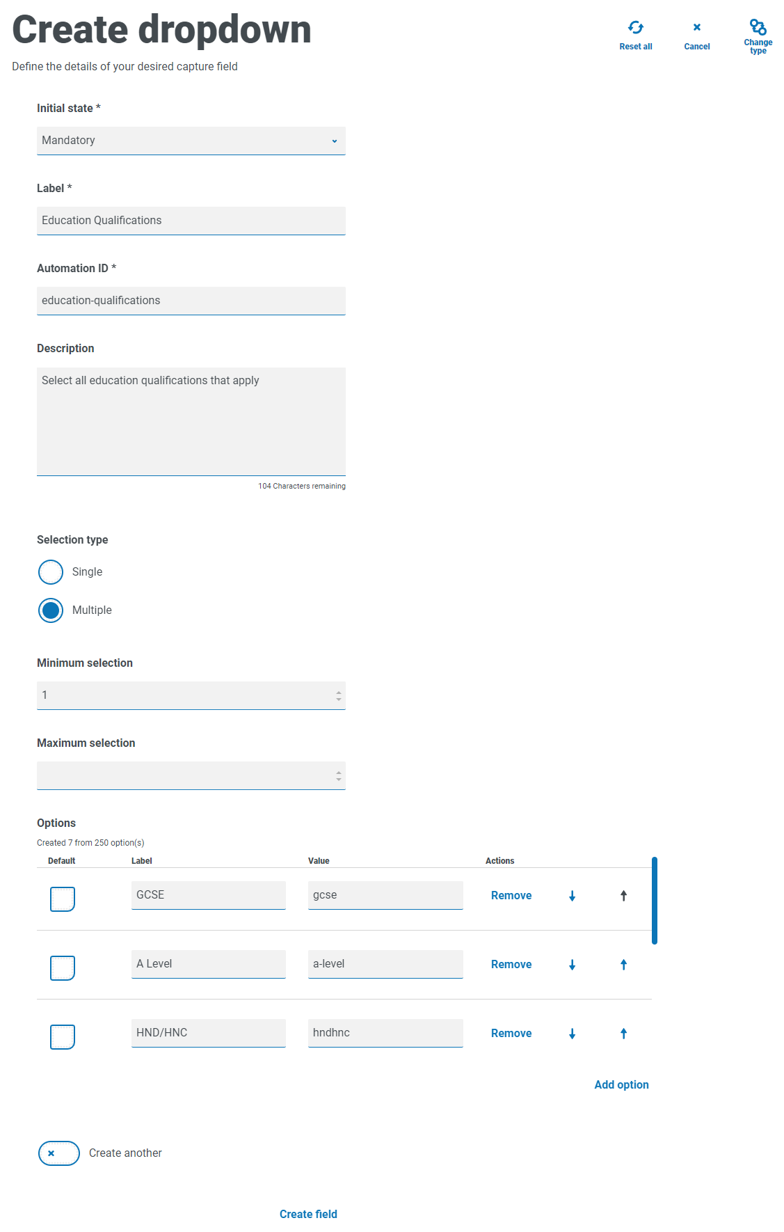
If a drop-down is created with multiple selection, then a restriction on whether the user has to select a minimum or maximum number of items can be applied.
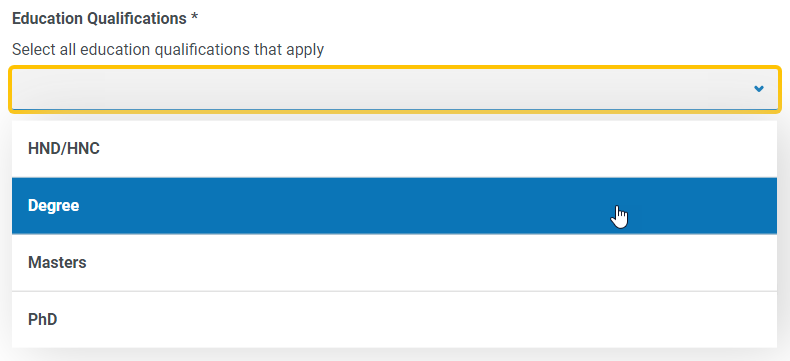
When items are chosen from the drop-down list, they will appear below the field on the form. Items selected accidentally can be removed by selecting the ‘x’ alongside the item.
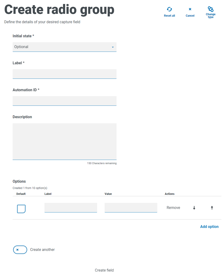
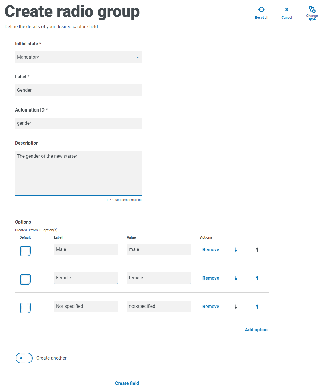
Radio group
The Radio group capture type, like the Dropdown, allows Interact users to select a single item – this capture type does not allow for multiple entries to be selected. The Radio group will take more real estate on the form so if there are a large number of items that need to be selected from, then a Dropdown may be a better solution.
You can control what the user sees by listing the chosen items and if required can choose a default value.
A maximum of 10 items can be added to a Radio group.
For information about the fields and their limitations, see Dropdown.
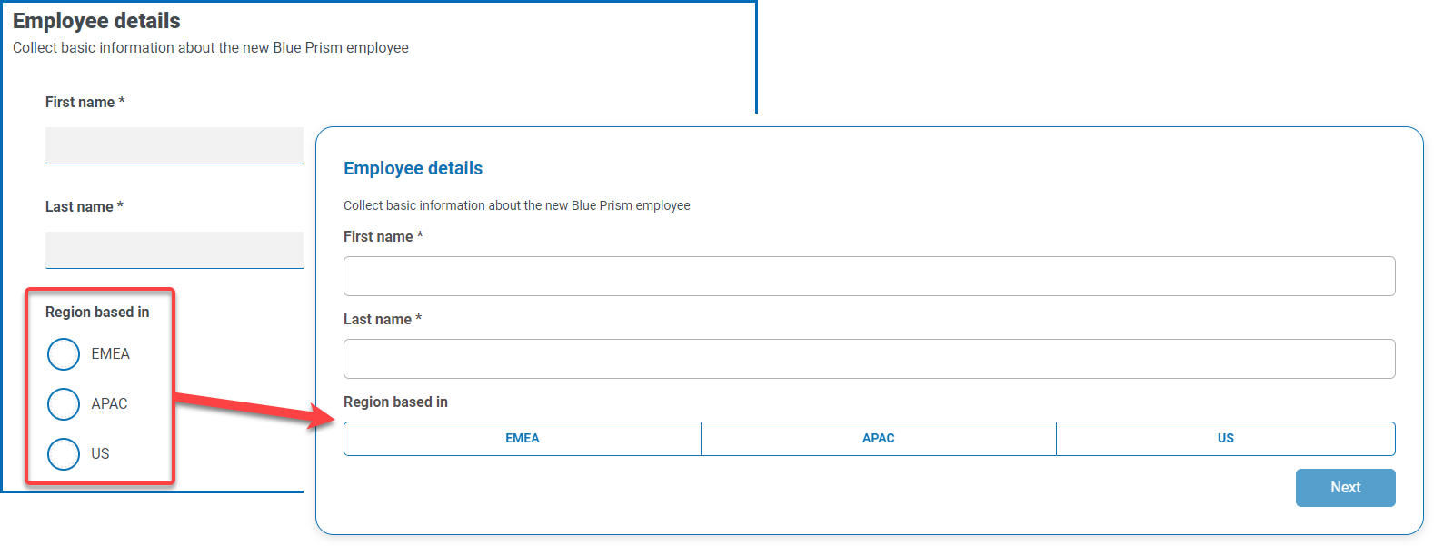
When the form is deployed to Interact, the radio group buttons display in a visually different way to that shown on in the
Radio group example
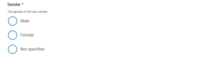
The example below shows a radio group where the user has to choose between three options.
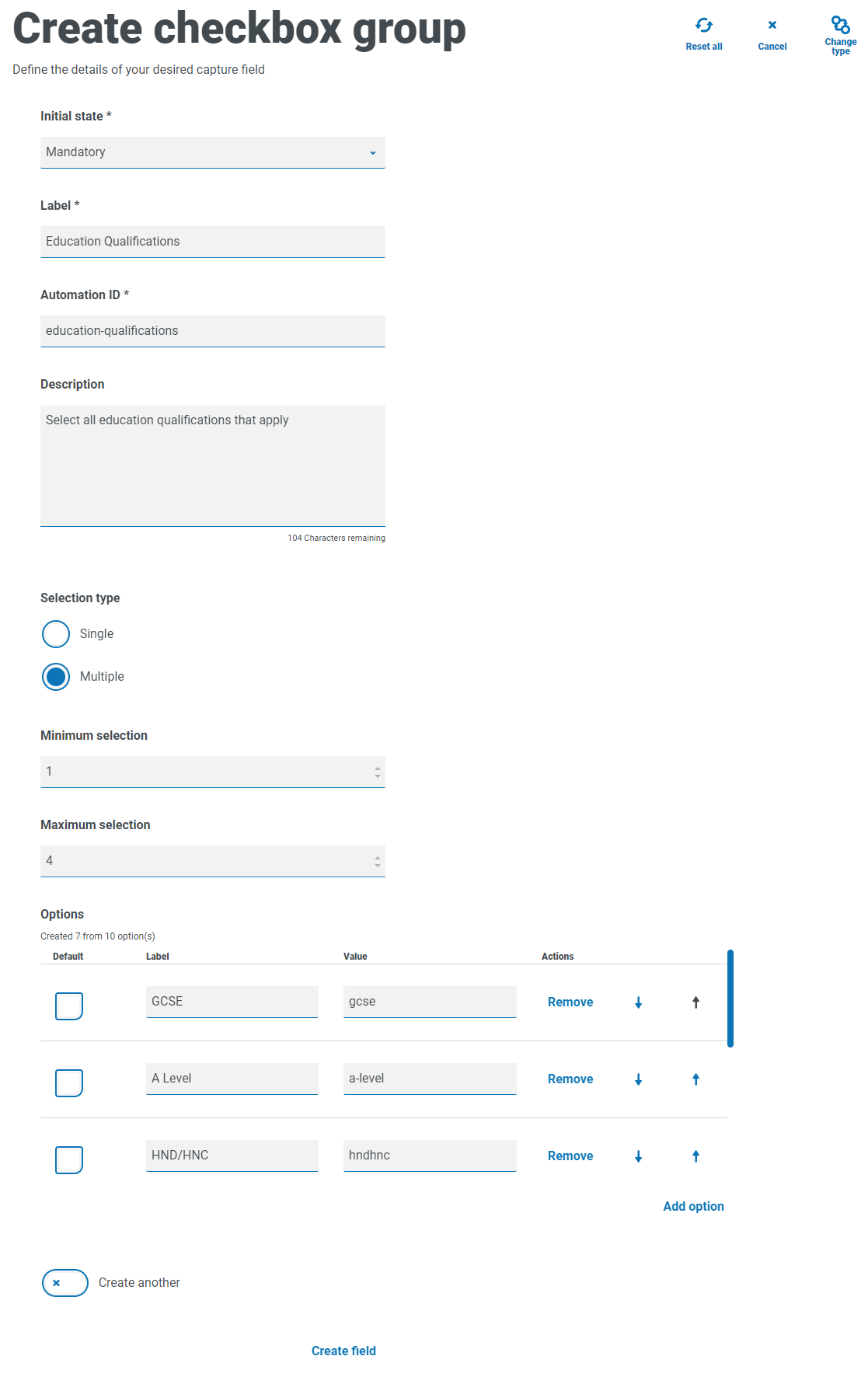
Checkbox group
The options available when configuring the Checkbox group are the same as the Dropdown. The Checkbox group can be configured to allow either a single selection or multiple selections. Similarly the number of items that can be chosen can be set using the Minimum selection and the Maximum selection values. The Checkbox group displays all the items on the form, as opposed to the Dropdown field where the user scrolls through a list.
A maximum of 10 items can be added to a Checkbox group.
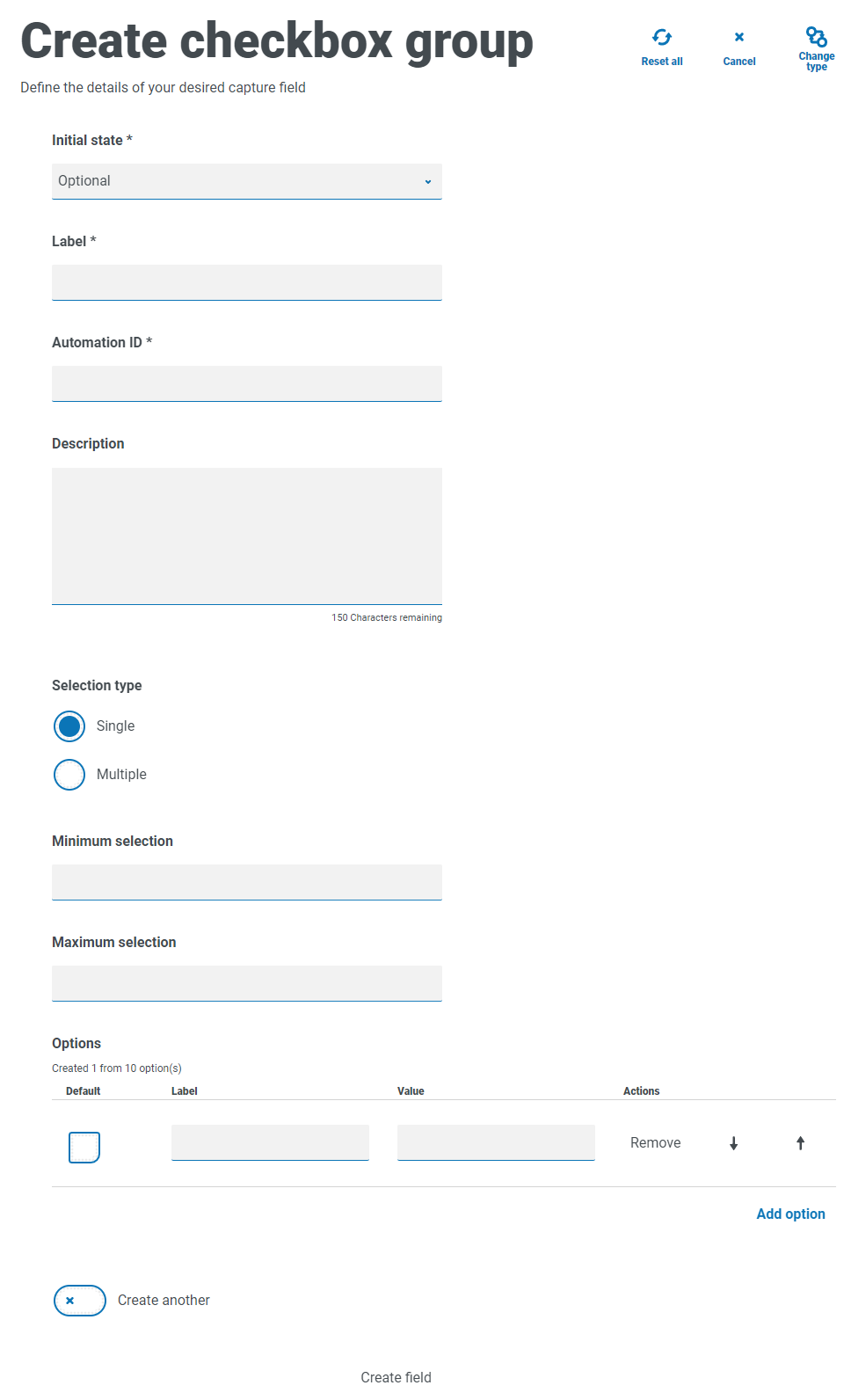
For information about the fields and their limitations, see Dropdown.
Checkbox group example
The example below shows a Checkbox group where there are six options that the user can select from. However, if the field is left as a single selection type, the user can only select one item. This is the same functionality as the radio group field but presents a different display.


If the multiple selection type is the chosen, the user can select multiple items from the display. However, you can restrict the number chosen by setting a minimum and maximum selection value.

Table
The Table capture type enables you to enter a table within a form that can be used to collect data. You can control the number of rows in a table that the Interact user sees, construct the number of columns that are needed and assigns column headings. A maximum of 15 columns can be added to a table. The user can then add or delete rows to the table as controlled through the settings on the table element.
You can set the Initial row count, the Minimum number of rows, and the Maximum number of rows.
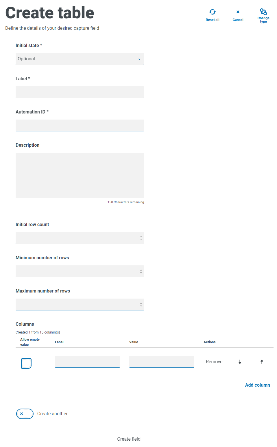
Table example
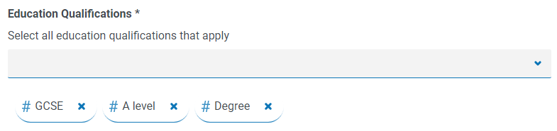
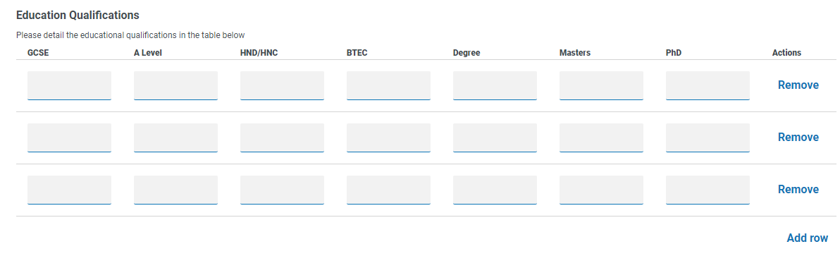
In this example, education qualifications are being collected and the user would be expected to enter into the field the qualifications they have at the appropriate level. This example defines a table starting with an initial row count of three rows, with the maximum rows that a user can go to set as 12 rows. This displays the following:
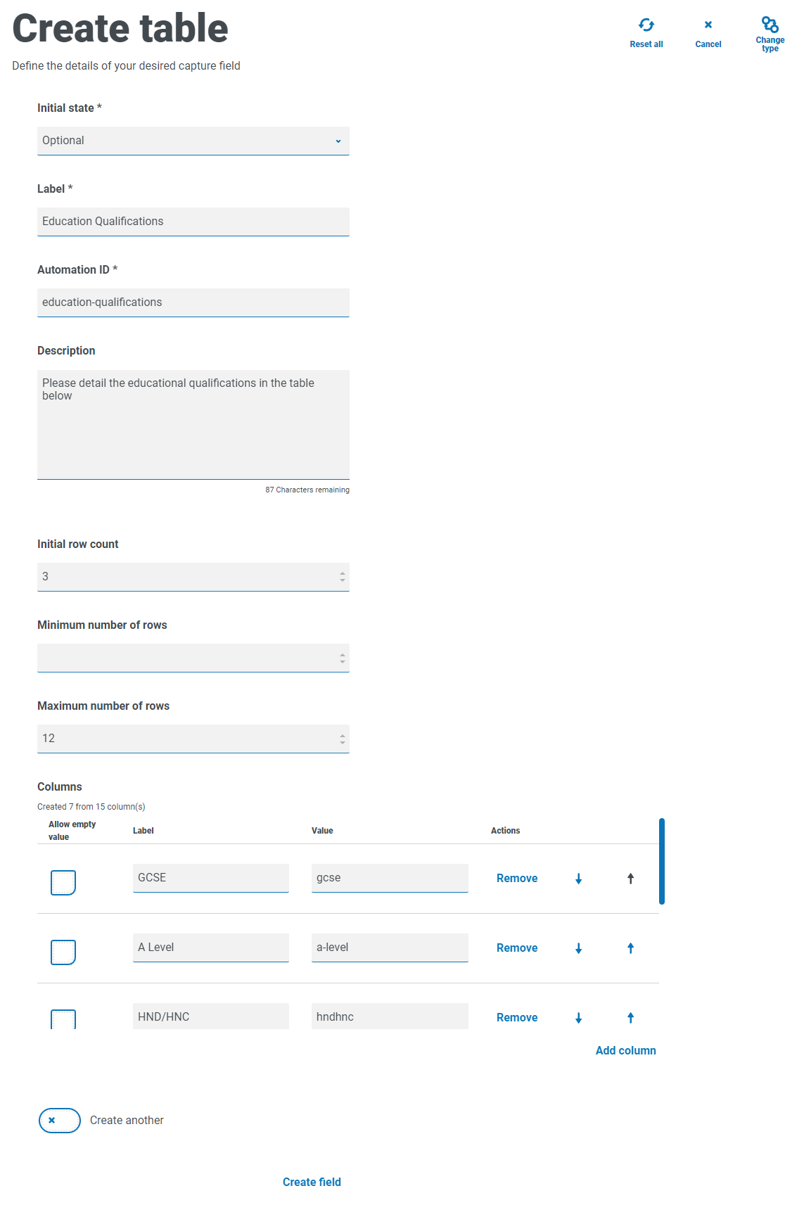
The use of the initial state is important. If you set the Table field to a state of mandatory and you specify a table of 6 columns by 3 rows, then the user will need to fill in every cell in the table with a value before the request can be submitted. This could be a requirement, but the use of the optional state may be better in most table fields. However, you can use the mandatory state in combination with setting a column to allow blank or empty values within the column. This is performed by selecting Allow empty value alongside the column you will allow blank values in.
