Docs
Docs
Control Room – Dashboard widgets
The Control Room plugin also provides a number of dashboard widgets, which you can apply and customize to monitor your Blue Prism environment at a glance.
-
On the Dashboard, click Edit widgets.
The widgets that can be customized display an Options icon; all widgets display a Remove icon.
-
Click Options next to the required plugin.
The Display options panel displays.
-
Set the options as required and click Close drawer.
The widgets update as soon as the options are selected and the Display options panel closes.
Monthly utilization diary
This enables you to view the level of use of your digital workforce for each day of a month. You can hover over a block in this chart to view the utilization level. An example of the Monthly utilization diary widget is shown below:

The darkest color indicates the highest level of use, the lightest color is the lowest level.
Utilization chart
This displays how much the selected digital workers are used as a line graph against the hours for a given date.
To configure the widget:
-
On the Utilization chart widget, click Filter.
The Filter panel displays.
-
Under the Select digital workers filter, enter the digital worker name or select one from the drop-down list. You can have more than one digital worker set for this widget.
For example (with the options set to activity and minutes):
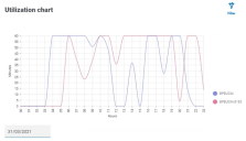
- Click Close drawer to close the Filter panel.
- If you want to view the information for a different day, enter the date in the date field and press Enter.
- If required, use the options to customize this display further.

Utilization heatmap
This displays a list of digital workers and the hours that they were utilized for a given date. By default, it will show you the data for the current date.
To configure the widget:
- On the Utilization heatmap widget, click Enable labels to view a numerical value within each of the colored squares. You can click Disable labels to remove these values.
-
If you want to view the information for a different day, enter the date in the date field and press Enter.
The Utilization heatmap updates. For example (with the options set to activity and minutes):
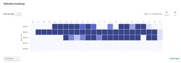
The darkest color indicates the highest level of use, the lightest color is the lowest level.
- If required, use the options to customize this display further.

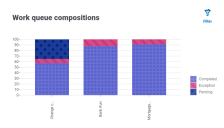
Work queue compositions
This enables you to view the composition of work queue items across your work queues. When you add the widget, it will not display any data.
To configure the widget to point at a specific work queue:
-
On the Work queue compositions widget, click Filter.
The Filter panel displays.
- Under the Select queue filter, enter the queue name or select one from the drop-down list.
-
Click Close drawer to close the Filter panel.
The widget displays the information for the work queue that you want to monitor. For example: