 Docs
DocsInteract Forms
Forms is a Hub plugin that can be found under the Interact section in Hub.
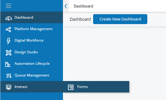
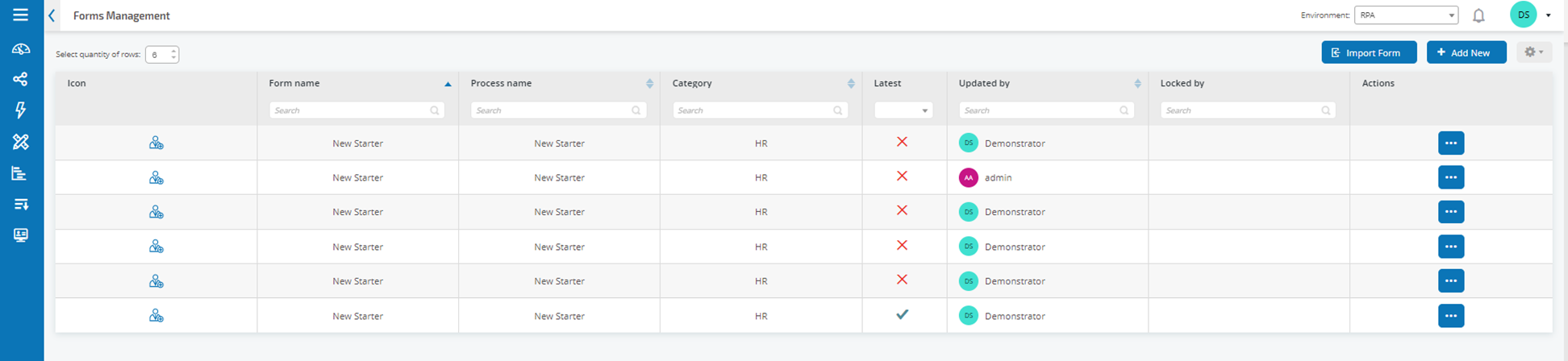
The first time you use Forms, the Forms Management screen displays.
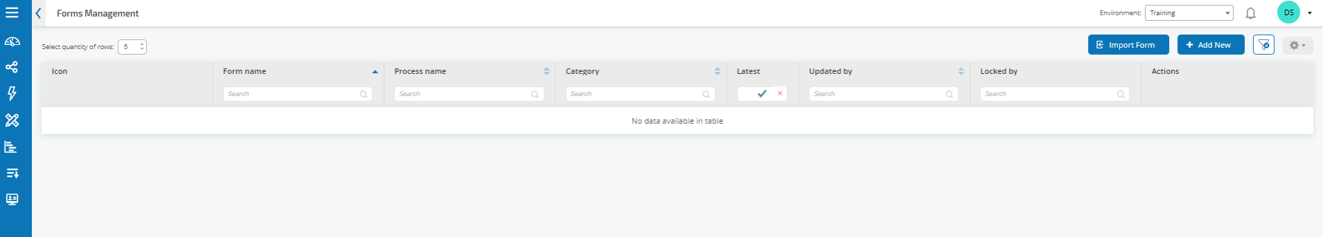
This screen lists any forms that have been created, their status, and whether they are locked for editing.
Create a form
Before you can create a form, a business process must already exist. If the Add New button is greyed out there are no available business processes to create a form for. You can only have one form associated with a business process. For more information about creating business processes, see ALM – Business processes.
-
From the Forms Management screen, click Add New.
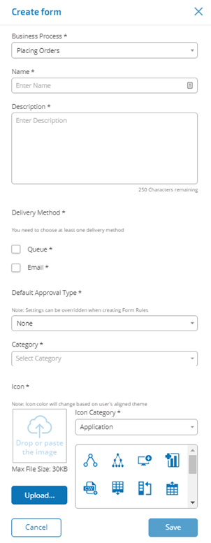
The Create form screen displays.
-
Complete the following mandatory fields to define the overall details of a form:
Business Process
The business process associated with the form you are creating.
Name
The name of the form.
Description
A description for the form.
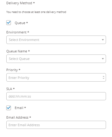
Delivery Method
The way the form will be delivered. Select Queue, Email, or both if required.
Selecting Queue allows the submitted request to be added into a Blue Prism Queue for processing. Complete the following fields to configure details of the queue:
- Environment – The environment that the submitted request will be made into.
- Queue Name – The queue in the selected environment that will be used to load the submission.
-
Priority – The business priority for the submitted form. This can be any value between 1 to 999 with 1 being the highest priority.
This functionality utilizes IADA and one of the key approaches used by IADA® is to measure the amount of work (queue items in Blue Prism) based on the Priority and Service Level Agreement (SLA). Each item is labelled with these metrics individually or inherits this value from the associated business process to support the ordering of work. When a digital worker is ‘available’ to execute a process, IADA® identifies the next best item based on configurable properties and returns the activity to the digital worker.
- SLA – The business Service Level Agreement (SLA) timeframe in which the submitted request should be processed within. The definition is ddd.hh:mm:ss and the range from 000.00:00:00 to 999.23:59:59.
Selecting Email will allow the submitted request to be forwarded to an email address for review. This is not the approval submission.

Default Approval Type
Allows the submission to be sent to another user for approval before it is sent for processing. By default, this is set to None, meaning the submission is not sent for approval.
You can also select Any Approver or Single Approver. For Single Approver the form will prompt you to enter the user who will approve any requests from the form before submission.
Category
Allows forms to be grouped together in a defined category to determine who can access the form. For example, you may have categories for Finance, HR and Sales so you can allow specific users access only to the forms in the category that they need to do their role.
Categories are defined by entering the name of the category. Once entered, a category will be available from the drop-down.
Icon
Select the image that will appear with the form in Interact to allow easy identification. You can choose one of the preloaded icons which are defined into categories: Application, Banking, Data, Education, Emotion, Food, Gadgets, Medical, Network and Security, Science and Technology, Transportation, and User Interface. Alternatively, you can load your own icon by selecting Upload and browsing to your icon. Icons must be a PNG, JPG or SVG file, no bigger than 256 x 266 px and 30KB in size.
- Add the required elements to the form:
-
Once all the required elements have been added, click Save.
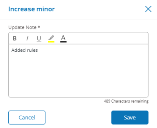
The Increase minor dialog displays.
Each time you save a form the minor version increases to assist with version control.
-
Enter a description for the save that will allow you to identify what changed for this minor version.
-
Click Save.
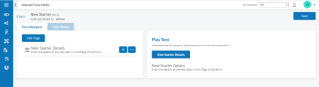
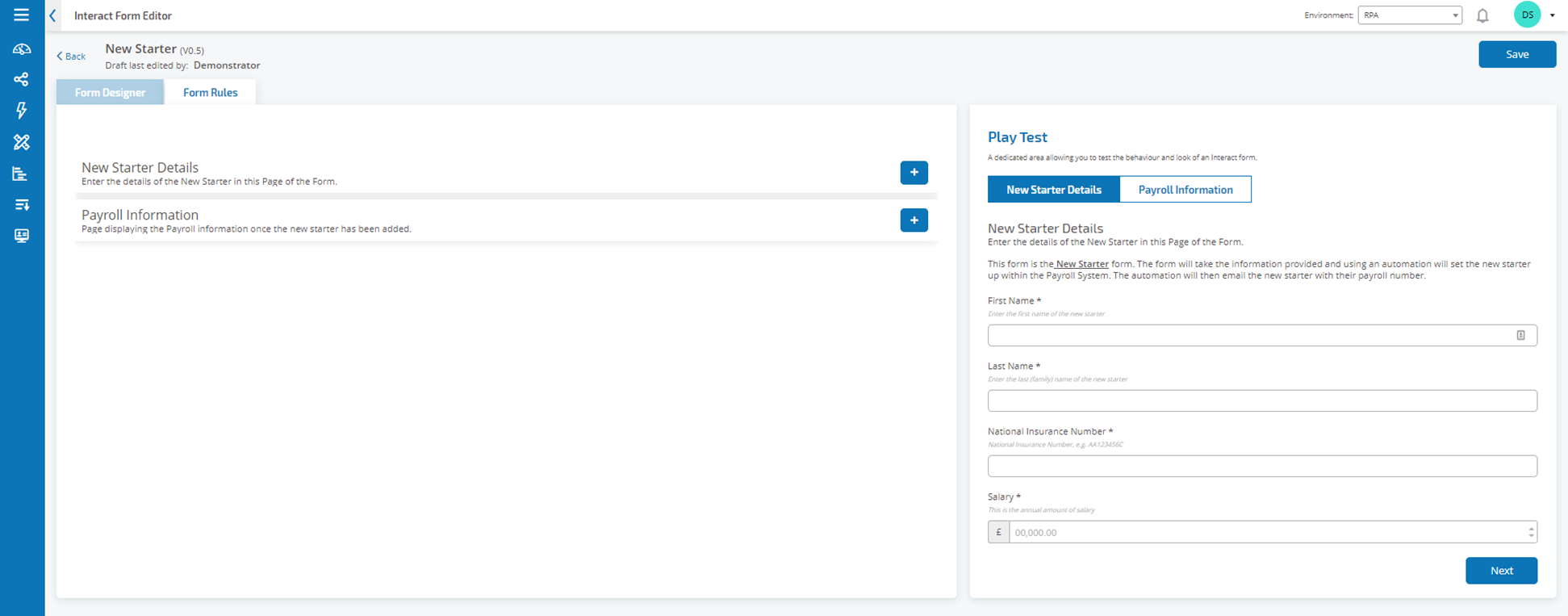
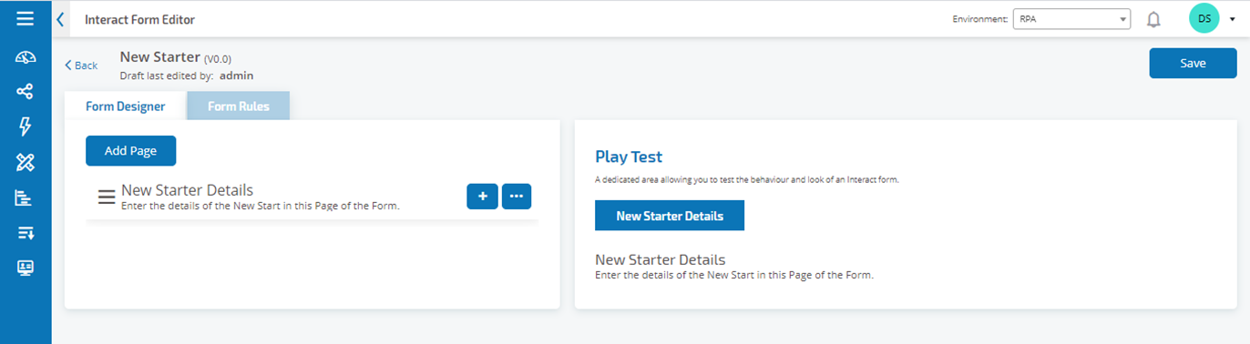
The Interact Form Editor displays.


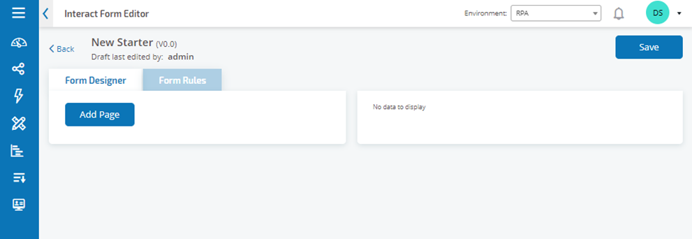
Add pages to a form
Pages are like tabs on a dialog so you can have multiple pages per form to break the amount of information required into specific sections. Or define Rules so that only specific Pages will appear when certain criteria are met.
-
From the Interact Form Editor, click Add Page.
- Enter a name and description for the new page.
- If required, select the Hidden check-box. When selected the page will only display when certain criteria is fulfilled.
- To immediately create another page, select the Create Another check-box. When you save this page, the dialog will be refreshed allowing details for a new page to be entered.
-
Click Save.
The Interact Form Editor displays showing the new page.

Add fields to a form
-
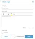
From the Interact Form Editor where a form has already been created, click the + button.
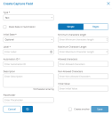
The Create Capture Field displays.
-
Complete the following fields:
Type
This is a dropdown field allowing you to select the type of field you want to add to the form, we will cover each of the types providing examples in the Types section below.
The field type to add to the form. For more information about the available fields, see Field types.
Initial State
The state that the field is set to when a user first accesses the form:
- Optional – Does not matter whether a user completes the field or not.
- Mandatory – Must be completed by the user before the form can be submitted.
- Read-Only – The field cannot be edited. This is typically used as an input from an automation where the information has been retrieved and updated so the user can review.
- Hidden – The field has rules applied so that it only appears when a predetermined condition is achieved.
Label
This is the text that will appear alongside the field in the form. This is a friendly name so a user can understand what they should be entering into the field;
Automation ID
this is the name that ties to the data item within the automation. This field has a restricted format, it can only be lowercase letters and no spaces or special characters are allowed. A hyphen, ‘-‘, is allowed to represent a space. When a Label is applied an Automation ID is automatically generated using the formatting restrictions, this though is only a suggestion and can be changed if required;
Description
though this is not a mandatory field it provides the ‘help text’ alongside the field in the form;
Mask Data on Submission
again a non-mandatory field, but if the data that is entered is of a sensitive nature, by selecting this option once the request has been submitted the data is redacted from review.
-
Click Save.
Each field is added to the Interact Form Editor.
You can reorder the field using the hamburger menu for a field to drag and drop it into a new location.
You can select one field to be identified as the key field using Make Key Field option. Once selected a key will appear alongside the field in the form. This information can then be used within Interact submissions as a filter to look for particular text. For more information see Interact user interface.
Only a Text or Number field type can be selected.


Field types
There are eleven different field types listed below with examples and configurable parameters.
 Text field
The text field is the most commonly used field. It allows information data to be captured and will allow alphanumeric combinations; so, both letters and numbers are accepted.
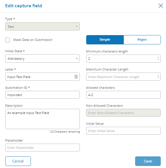
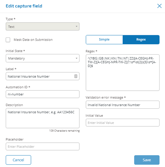
In the example above we have made the field mandatory and set a minimum limit of two characters but no maximum limit on the number of characters entered. We have though restricted the field to upper case characters by applying a Simple character restriction. Using the Regex function you can create a complex character string restriction. If we take the UK National Insurance Number as an example, we can apply the Regex that will ensure that the correct format is always entered, if not a warning message will be given.
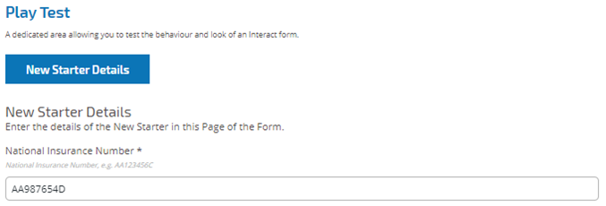
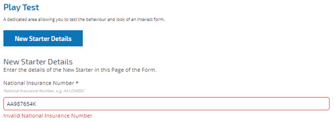
Using this to test the character string restriction in the Play Test area we can see a correct and incorrect format submitted.
Mask Data on Submission is only available within the text field. Therefore, if you want to submit a number and redact the content after submission then use a text field to input rather than a number field.
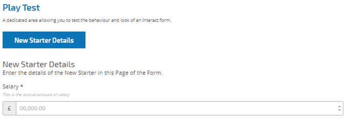
Number field
The number field restricts the entry to numerical characters only. The field does support the use of the ‘.’ As a decimal point and the ‘,’ for the thousand’s separator. If the number is a financial number, you can use the prefix character to apply any applicable currency symbol. Additionally, you can force the use of the ‘,’ as the number is typed by selecting the ‘Show Commas’ option. Finally, you can assign a minimum and/or a maximum value to the number if appropriate.
Multiple countries use decimal comma rather than a decimal point as a separator. If this is required it is recommended that a text field is used to define the applicable format rather than a number field.
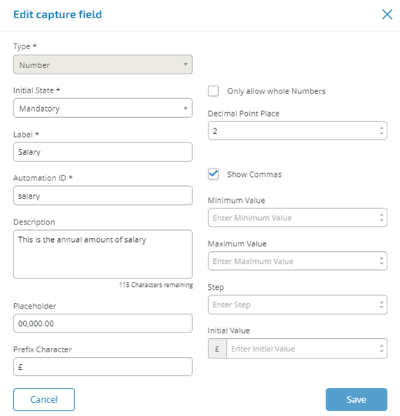
In the example number field above, we are showing a salary field. This captures a salary, prefixing it with the ‘£’ symbol and forcing the ‘commas’ to be applied as a thousand’s separator. In this example we have also defined a Placeholder. A Placeholder will show greyed text in the field prior to be typed into, thus a representative value can be displayed.
If you want to apply a specific Regex to a number then use a text field. This will enforce the format that you need. For example, the following Regex will check that a UK Mobile Telephone is entered correctly: ^07([\d]{3})[(\D\s)]?[\d]{3}[(\D\s)]?[\d]{3}$
Date field
The date field allows you to use a calendar pop-up to select a date. The date can be configured to meet specific configuration parameters.
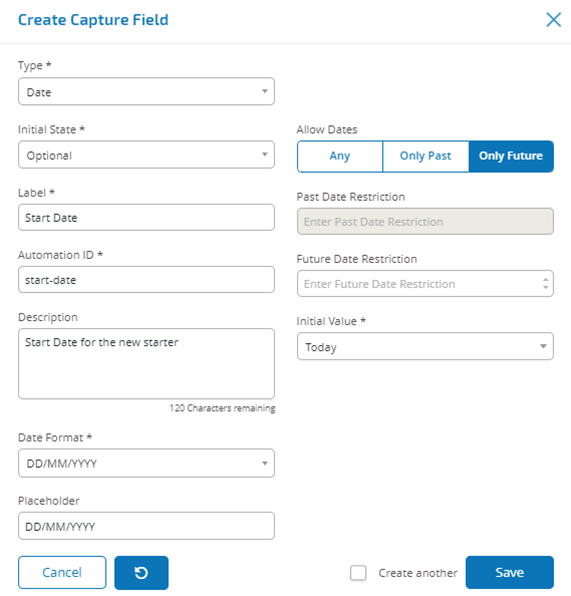
The example shows a new starter joining date selection. We have chosen the specific format for the date as DD/MM/YYYY where there are two other options which are MM/DD/YYYY or YYYY/MM/DD. We have entered a Placeholder showing the format that the date will appear in and restricted the searching the date to only dates in the future from Today’s date. If we select ‘Today-‘ as the Initial Value you can then enter a number of ‘Days from Today’s Date’ which restricts the calendar to commence a number of days past. Additionally, using the ‘Past Date Restriction’ or ‘Future Date Restriction’ you can create a ‘window’ on the dates that the user of the form can access, for example setting 14 days will create a window of just 14 days that the user can access.
When using the ‘Past Date Restriction’ or ‘Future Date Restriction’ field in conjunction with ‘Today-‘ or Today+’ then the date restriction must include the total number of days. The number of days for the window and the number of days past or future. When reviewing the output, the user will see a pop-up calendar that they can use to select the date they require.
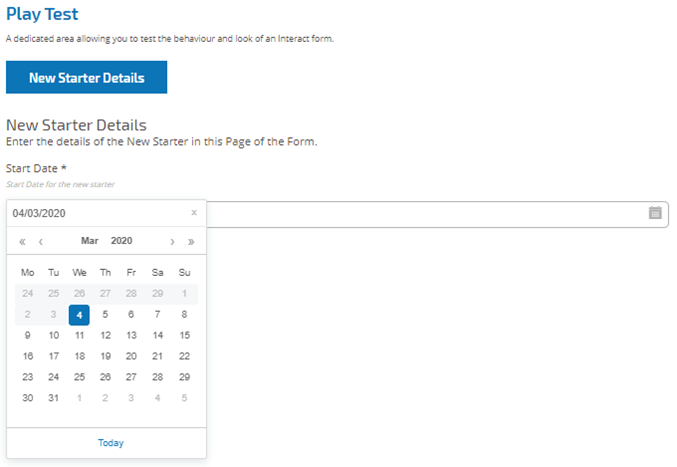
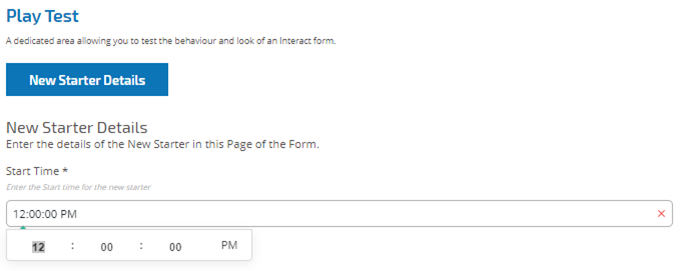
Time field
The time field allows the user to select from dropdown menu a particular time. The format for the time is a 12-hour clock and allows the user to select either AM or PM.
The images below show the date field capture properties and an example display within a form.
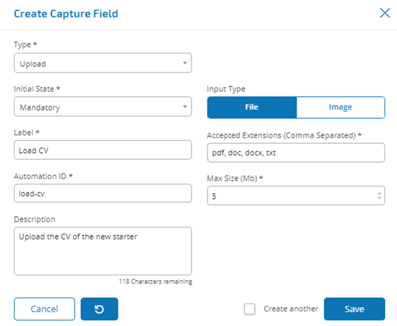
Upload field
The upload field allows a file or image to be parsed into an automation for further processing. The transfer is for any formats except for executable files with a .exe file extension.
Files are stored within ‘blob’ storage and a URL is included in the collection sent to the Blue Prism Queue. An example upload field is shown below.
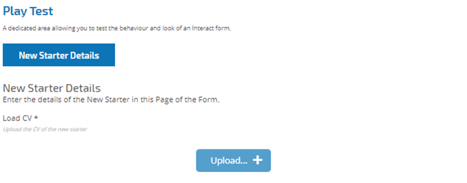
In the example below the Interact user will be allowed to upload a CV of the new starter. The document that is uploaded can in PDF, Microsoft Word, or Text format.
The maximum file upload size is 5Mb and the image size is restricted to 1920x1080 px.
The allowed extensions must be entered without a leading ‘.’.
The user will see the following in the form when they are submitting a request.
Paragraph field
The paragraph field allows you to put formatted text onto the form so that it can provide information to the Interact user. The text is not submitted as part of a request to Blue Prism and therefore there is no Automation ID.
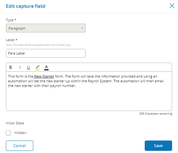
You can use formatting techniques to bold, underline, italicize, and highlight text. Additionally, the text can be hidden until a rule condition is used to display.
The text will appear in the form as illustrated below.
Horizontal rule field
The horizontal rule field does not have any use within an automation it is used for ‘cosmetic’ purposes to break up large pages in a form. The horizontal rule can be padded as shown below.
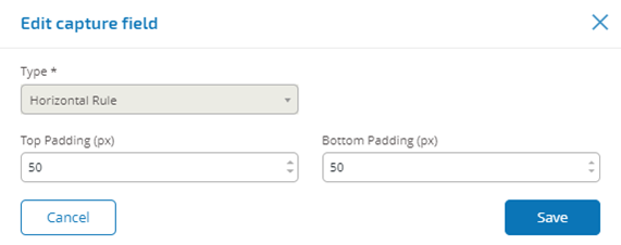
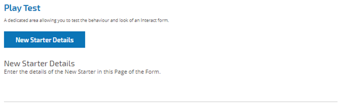
The image below shows the horizontal rule field in use.
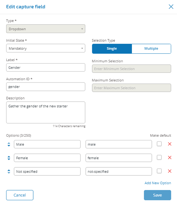
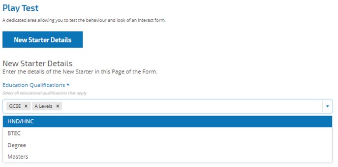
Dropdown field
The dropdown field allows an Interact user to select either single or multiple items from a dropdown menu. An example configuration of a single selection dropdown field.
This will create the following element in the form for the user to access.
If a dropdown is created with multiple selection then a restriction on whether the user has to select a minimum or maximum number of items can be applied.
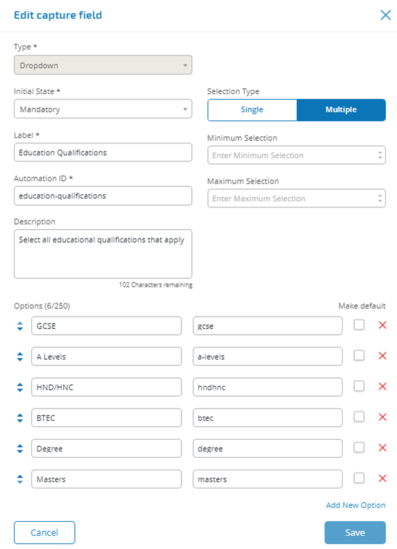
If you put the dropdown items in the wrong order you can use the arrows to the left to reorder the list.
When items are chosen from the dropdown list, they will appear in the field on the form. Items selected accidentally can be removed by selecting the ‘x’ alongside the item. This would remove the item from the field in the form.
The radio group and checkbox group fields do a similar function to the dropdown field, which is the selection of either a single or multiple items. However, if real estate on your form is of a premium then the dropdown is the recommended route especially if there is a large quantity of items. If there are only a few items to select from and the form overall size doesn’t matter, then either the radio group or checkbox group fields can be utilized.
A maximum number of 250 items can be added to a dropdown field.
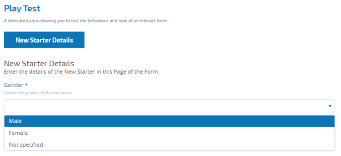
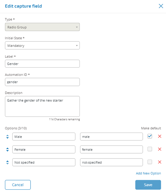
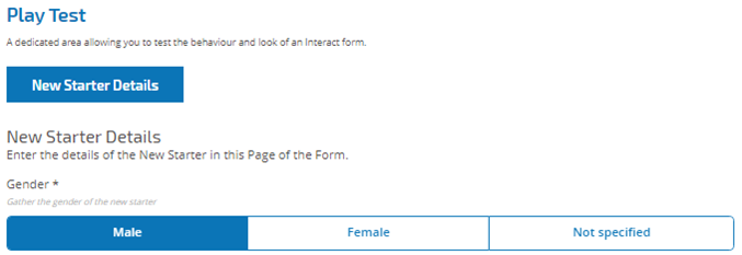
Radio group field
A radio group field like the dropdown field can be used to select a single item from a list. The difference is the display within the form. The radio group field will take more real estate on the form so if there are a large number of items that need to be selected from, then a dropdown may be a better solution. The example below shows a radio group where the user has to choose between three options.
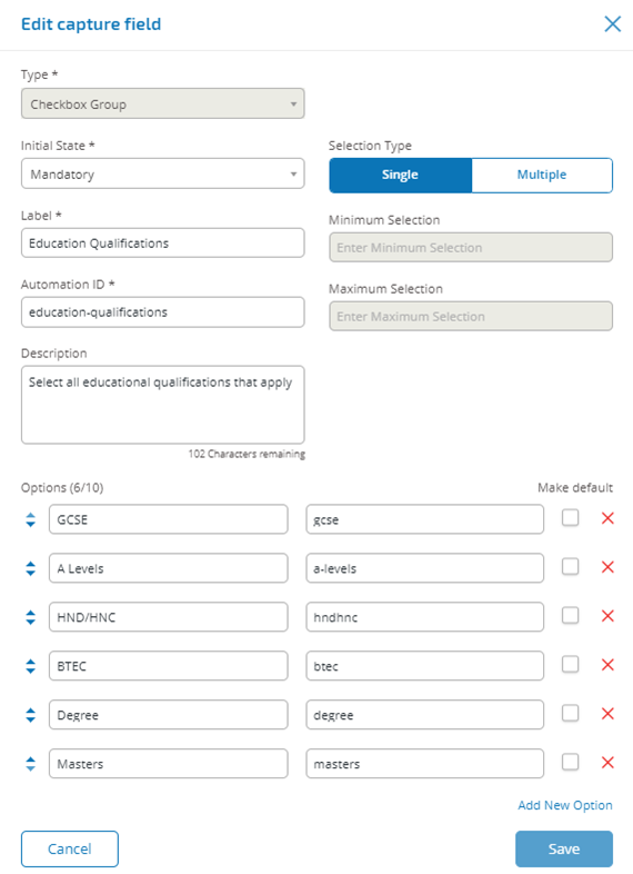
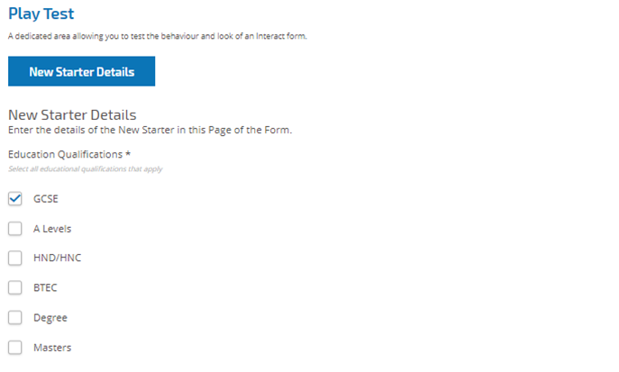
Checkbox group field
The checkbox group field is used when the developer wants to allow the user to choose more than one item from a display on the form. All the items will be shown as opposed to the dropdown field where the user scrolls through a list. The checkbox group field below shows a field established where there are six options that the user can select from. However, if the field is left at single the user can only select one item, this is the same functionality as the radio group field but presents a different display.
If multiple is the chosen option, the user can select multiple items from the display. However, the developer can restrict the number chosen by setting a minimum and maximum selection value.
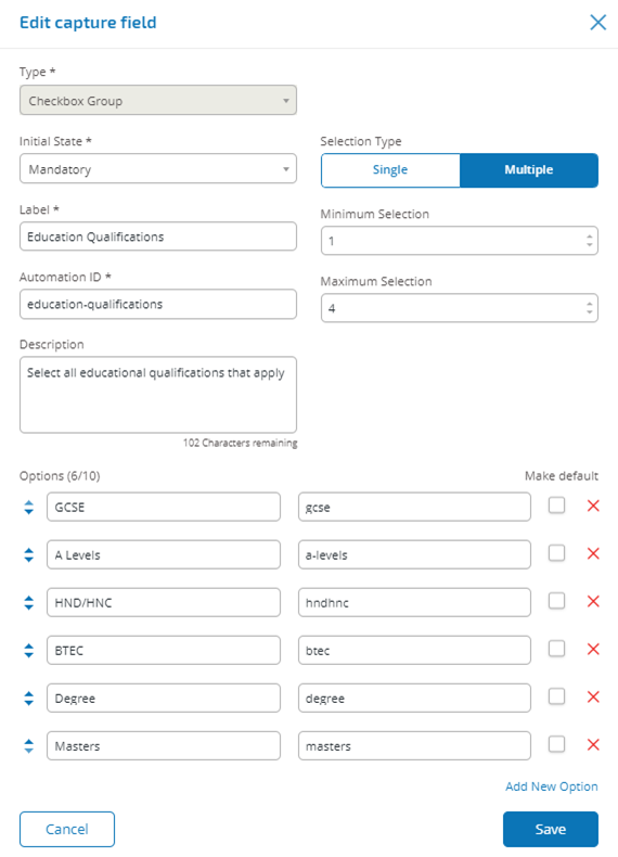

A maximum number of 10 items can be added to a checkbox group field.
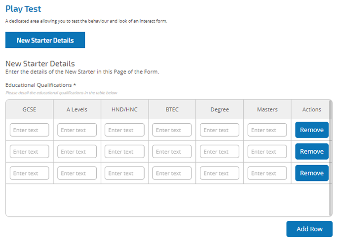
Table field
The table field allows you to enter a table within in a form that can be used to collect data.
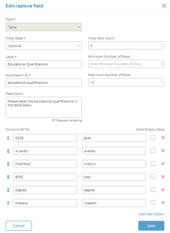
In this example we are collecting education qualifications and we would expect the user to type into the field the qualifications they have at the appropriate level.
We have started with an initial row count of three rows and the maximum rows that a user can go to we have set as 12 rows. This displays the following.
The use of the initial state is important. If you set the table field to a state of ‘mandatory’ and you specify a table of 6 columns by 3 rows, then the user will need to fill in every cell in the table with a value before the request can be submitted. This could be a requirement, but the use of the optional state may be better in most table fields. However, you can use the mandatory state in combination with setting a column to allow ‘blank’ values within the column. This is performed by selecting the ‘allow empty value’ alongside the column you will allow ‘blank’ values.
Rules
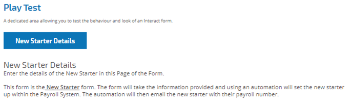
Rules enable the developer to control the form and activate different fields or pages depending on whether specified conditions are met. Using the Play Test area rules can be tested prior to releasing the form for normal user usage.
The inbuilt rule which is enforced in the Interact user interface, where you cannot move to a new page if there are mandatory fields that need to be completed on the current page, does not apply in the Play Test area. To apply Form Rules, select the tab alongside the Form Designer tab in the Interact Form Editor.
Add rules for a page
-
From the Interact Form Editor, select the Form Rules tab.
-
Click the + button for the page you want to create rules for.
The Create rules screen displays.
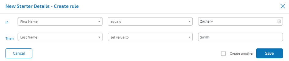
Rules are created based on a typical ‘If’ ‘Then’ statements, so if a specific condition is met, then a defined action defined is performed. The ‘If’ condition is dependent on the field type and the options for the rules will vary on specific field types. For example, for a text field the conditions for the ‘If’ are displayed.
- Configure the If statement:
- Select the field/page – In the If field, select the subject of the rule. This will be one of the fields from the associated page.
- Select the condition – The validation to perform on the field: contains, does not contain, etc.
- Select the value – The consequence of the clause being met, such as setting a field to be hidden
- Configure the Then statement:
- Select the field/page – In the Then field, select the field or page that is impacted by the If statement being true.
- Select the condition – The action to take on the Then clause: set value to, state is, etc.
- Select the outcome – The new value or state of the field or page in the Then statement.
-
Click Save to add the rule.
If Create another is selected, the dialog refreshes to allow a new rule to be configured, otherwise the Interact For Editor displays with the rules displaying under the associated page. From here, rules can be deleted and edited.


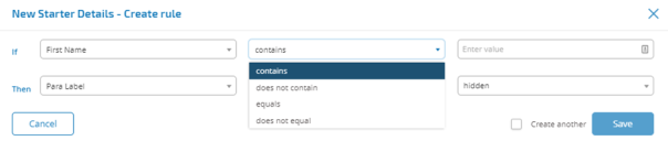
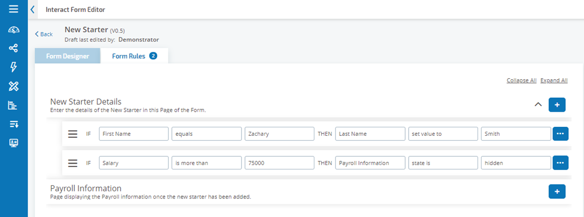 Example rules
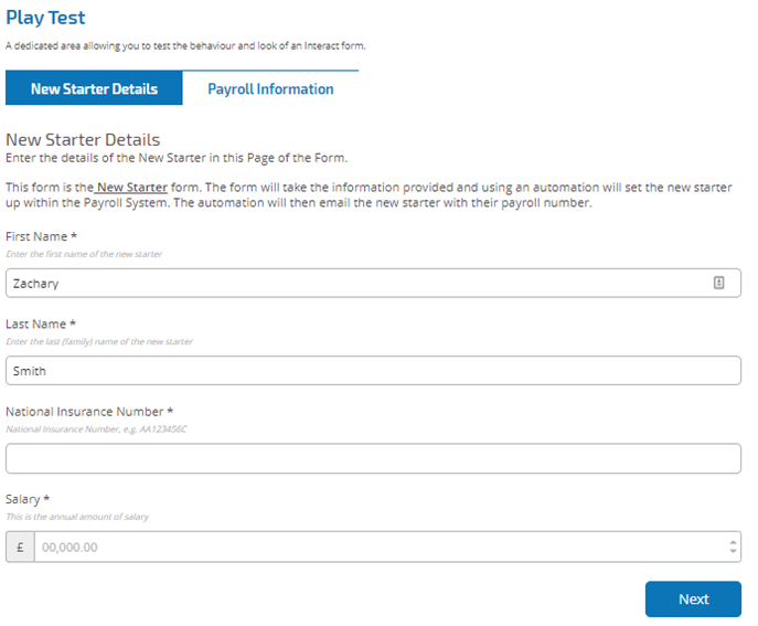
To show how Rules operate we have created an example where if the First Name field is set to Zachary then the Last Name will always be set to Smith.
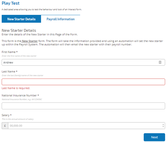
Going to the Play Test area we can now test this Rule. If we attempt to use Andrew in the First Name field and then click in the Last Name field, then click outside of the field we get a warning that the Last Name is required. However, if we put in the ‘First Name’ field ‘Zachary’ then click in the ‘Last Name’ field then ‘Smith’ is automatically added.
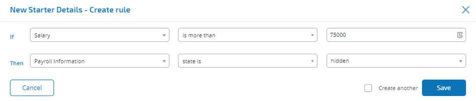
Within rules it is also possible to hide and unhide a field dependent on the initial state the pages in a form.
The following rule hides the Payroll Information page if the salary is over £75,000.
Version control
Forms are subject to version control to assist during development. Each time a form is saved the minor version is incremented and annotated with the entered description for ease of identification.
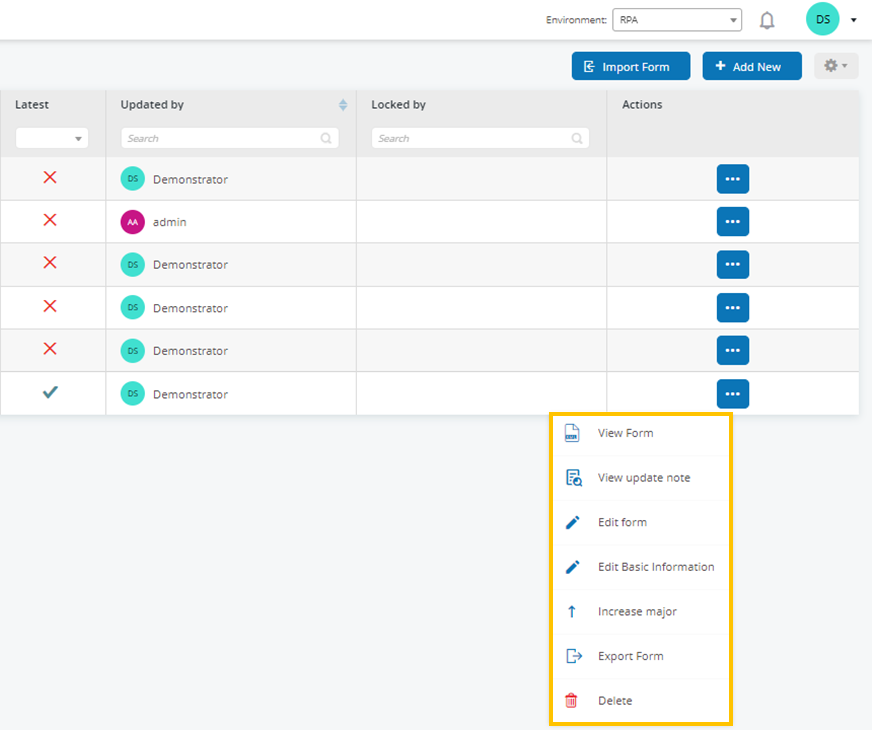
To view all the minor versions of a form in Forms Management section, remove the filter from the Latest column. All versions display and a tick in the Latest column denotes which is the most recent of those versions.
For the earlier versions you can select to View Form or View Update Note.
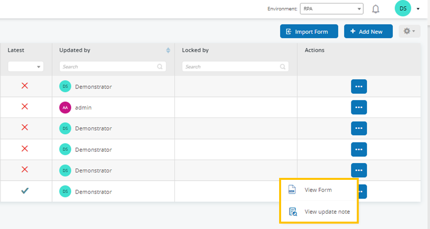
For the latest version of a form you can choose from the following:
- View Form – Displays the form and the Play Test area but you cannot edit or make changes to the Form.
- View Update Note – Displays the associated update note.
- Edit Form – Allows you to continue editing the form.
- Edit Basic Information – Allows the basic details associated with the form to be updated.
- Increase Major – Increases the form to a major version.
- Export Form – Exports the Form in a BPFORM file format for importing into another system.
- Delete – Delete the latest version of the form.
Test a form
The right hand pane of the Interact Form Editor screen is the test area where you can view the form as it will look to Interact users. It allows you to test and verify that any rules or field restrictions work as required.
Import a form
Forms that have been previously exported from this or another Interact system can be imported to save having to recreate forms that have already been developed.
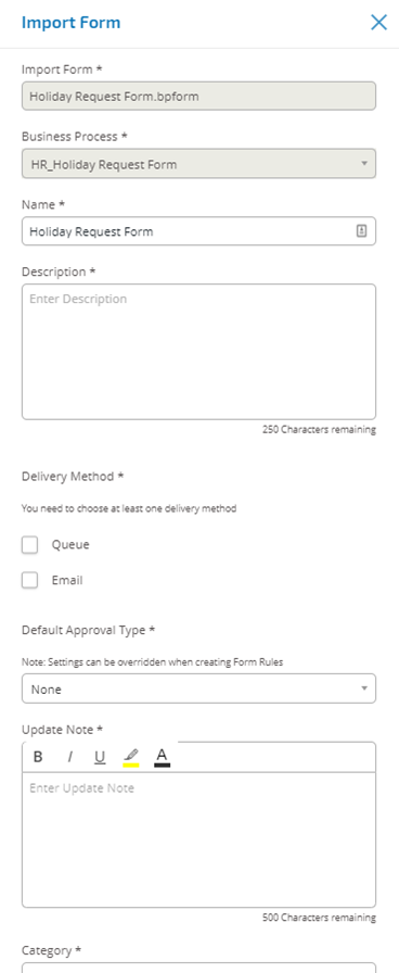
- In the Forms Management screen, click Import Form and navigate to the required exported form.
-
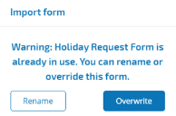
If the form already exists in your Interact system, you must select whether to rename or overwrite the existing form.
If importing a form that doesn’t already exist the form will get added with no prompt to override. A business process has to exist before you can select Add New. If the button is greyed out, then there are no available business processes to create a Form for. You can only have one form associated with a business process. See the Hub Automation Lifecycle Management User Guide for more details.
- Select the required option:
- Overwrite – The Import Form dialog displays. The dialog is the same as the edit or create form dialogs where a description, delivery method, default approval type, update note, category, and icon can be added.
Rename – The same Import Form dialog displays. As it is a rename, the required business process to which the form will be assigned must additionally be selected.
If there are not any Business Processes available that do not have a Form associated with them already, then you will not be able to Import the Form.

- Click Save to complete the import.

Forms management settings
Like most of the displays within the Hub plugins the view can be tailored to a specific requirement. This is done by selecting the cog in the top right of the Forms Management display.
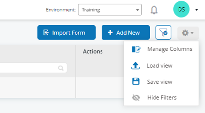
By selecting Manage Columns you can add or remove columns to create a view that is tailored to their requirements. There are additional columns that can be added to the default display.
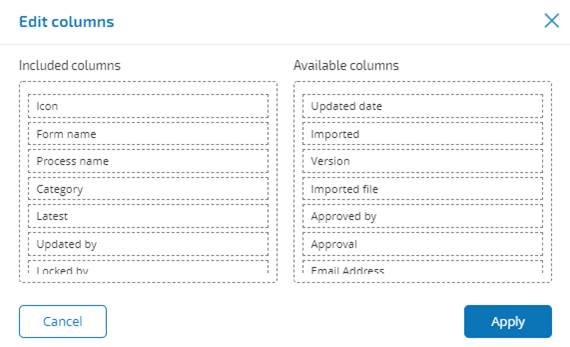
Once the required columns have been selected, the view can be saved so it can be easily applied when required.
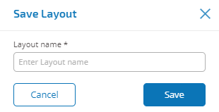
Select Save View from the settings cog.
Enter a name for the layout and click Save.
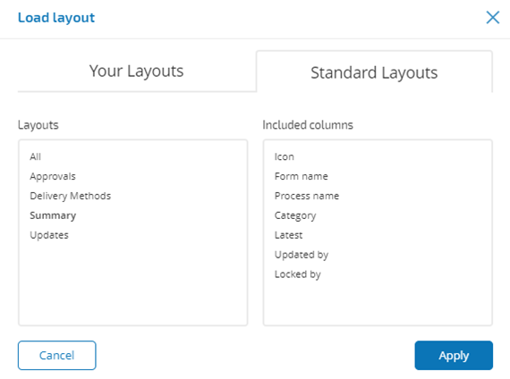
Layouts are applied by selecting Load View from the settings cog. You can choose from the pre-existing Standard Layouts or, where you have created your own layouts, from Your Layouts.
